MATLAB and Simulink Videos
Learn about MATLAB® and Simulink®, watch demonstrations about how to get started, and explore what’s new.
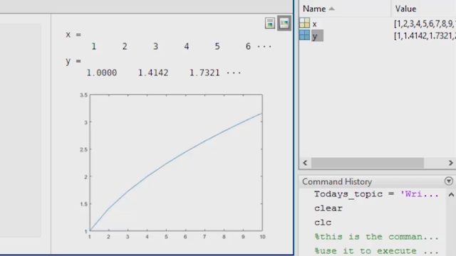
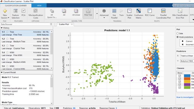
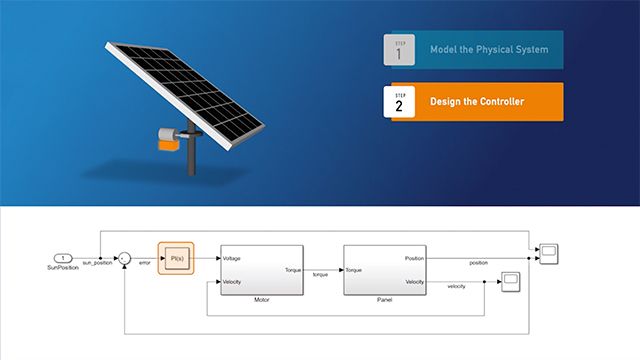
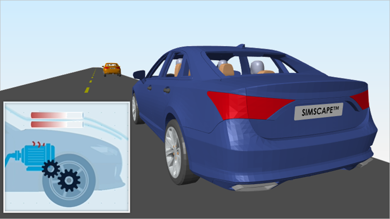
- MATLAB
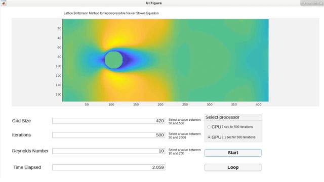
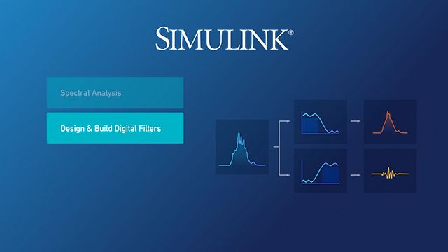
- Simulink
- 5G Toolbox
- Aerospace Blockset
- Aerospace Toolbox
- Antenna Toolbox
- Audio Toolbox
- Automated Driving Toolbox
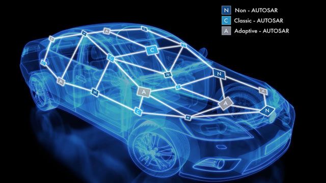
- AUTOSAR Blockset
- Bioinformatics Toolbox
- Bluetooth Toolbox
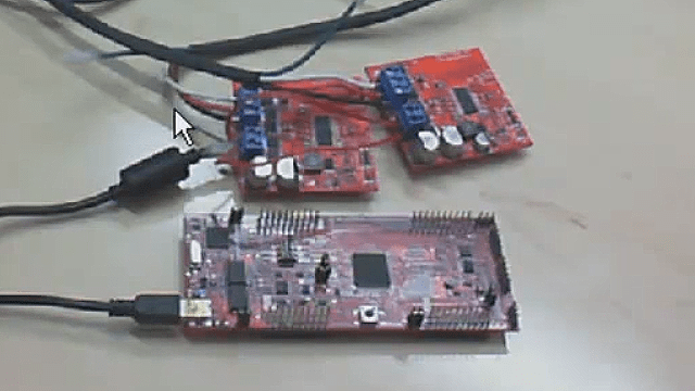
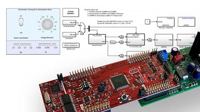
- C2000 Microcontroller Blockset
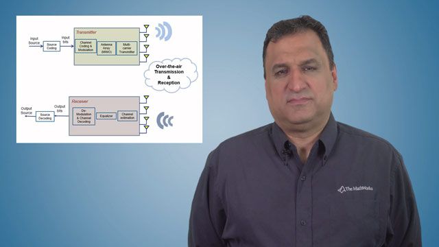
- Communications Toolbox
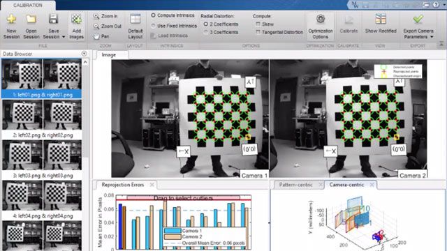
- Computer Vision Toolbox
- Control System Toolbox
- Curve Fitting Toolbox
- Data Acquisition Toolbox
- Database Toolbox
- Datafeed Toolbox
- DDS Blockset
- Deep Learning HDL Toolbox
- Deep Learning Toolbox
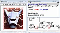
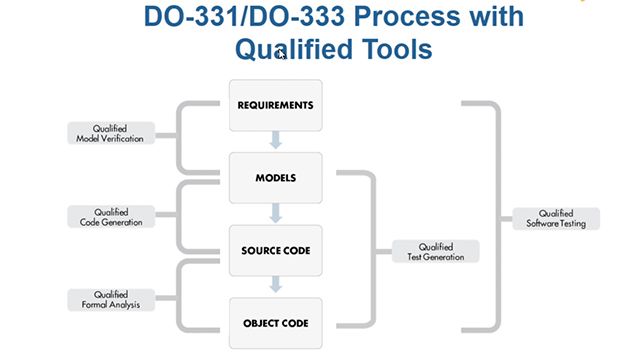
- DO Qualification Kit
- DSP HDL Toolbox
- DSP System Toolbox
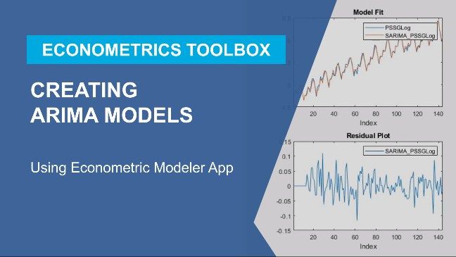
- Econometrics Toolbox
- Embedded Coder
- Filter Design HDL Coder
- Financial Instruments Toolbox
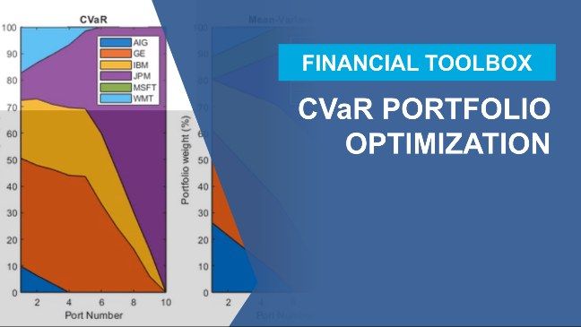
- Financial Toolbox
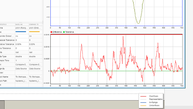
- Fixed-Point Designer
- Fuzzy Logic Toolbox
- Global Optimization Toolbox
- GPU Coder
- HDL Coder
- HDL Verifier
- IEC Certification Kit
- Image Acquisition Toolbox
- Image Processing Toolbox
- Industrial Communication Toolbox
- Instrument Control Toolbox
- Lidar Toolbox
- LTE Toolbox
- Mapping Toolbox
- MATLAB Coder
- MATLAB Compiler
- MATLAB Compiler SDK
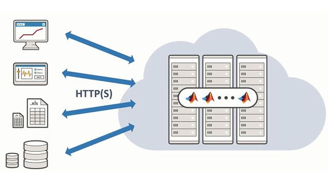
- MATLAB Online Server
- MATLAB Parallel Server
- MATLAB Production Server
- MATLAB Report Generator
- MATLAB Test
- MATLAB Web App Server
- Medical Imaging Toolbox
- Mixed-Signal Blockset
- Model Predictive Control Toolbox
- Model-Based Calibration Toolbox
- Motor Control Blockset
- Navigation Toolbox
- Optimization Toolbox
- Parallel Computing Toolbox
- Partial Differential Equation Toolbox
- Phased Array System Toolbox
- Polyspace Access
- Polyspace Bug Finder
- Polyspace Bug Finder Server
- Polyspace Client for Ada
- Polyspace Code Prover
- Polyspace Code Prover Server
- Polyspace Server for Ada
- Polyspace Test
- Powertrain Blockset
- Predictive Maintenance Toolbox
- Radar Toolbox
- Reinforcement Learning Toolbox
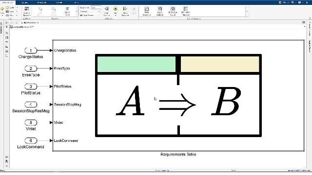
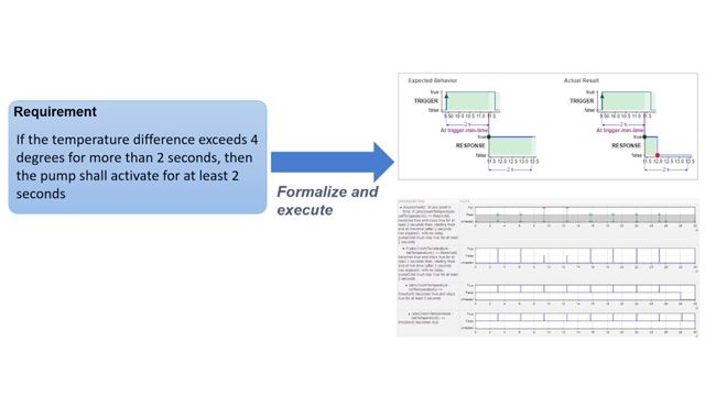
- Requirements Toolbox
- RF Blockset
- RF PCB Toolbox
- RF Toolbox
- Risk Management Toolbox
- RoadRunner
- RoadRunner Asset Library
- RoadRunner Scenario
- RoadRunner Scene Builder
- Robotics System Toolbox
- Robust Control Toolbox
- ROS Toolbox
- Satellite Communications Toolbox
- Sensor Fusion and Tracking Toolbox
- SerDes Toolbox
- Signal Integrity Toolbox
- Signal Processing Toolbox
- SimBiology
- SimEvents
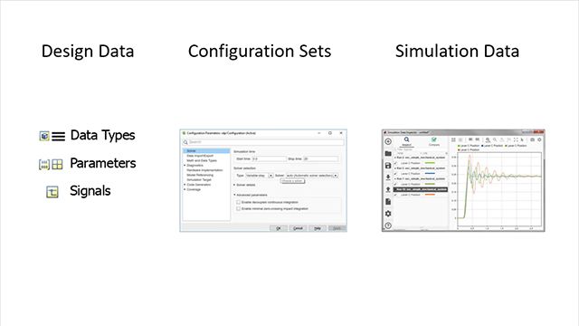
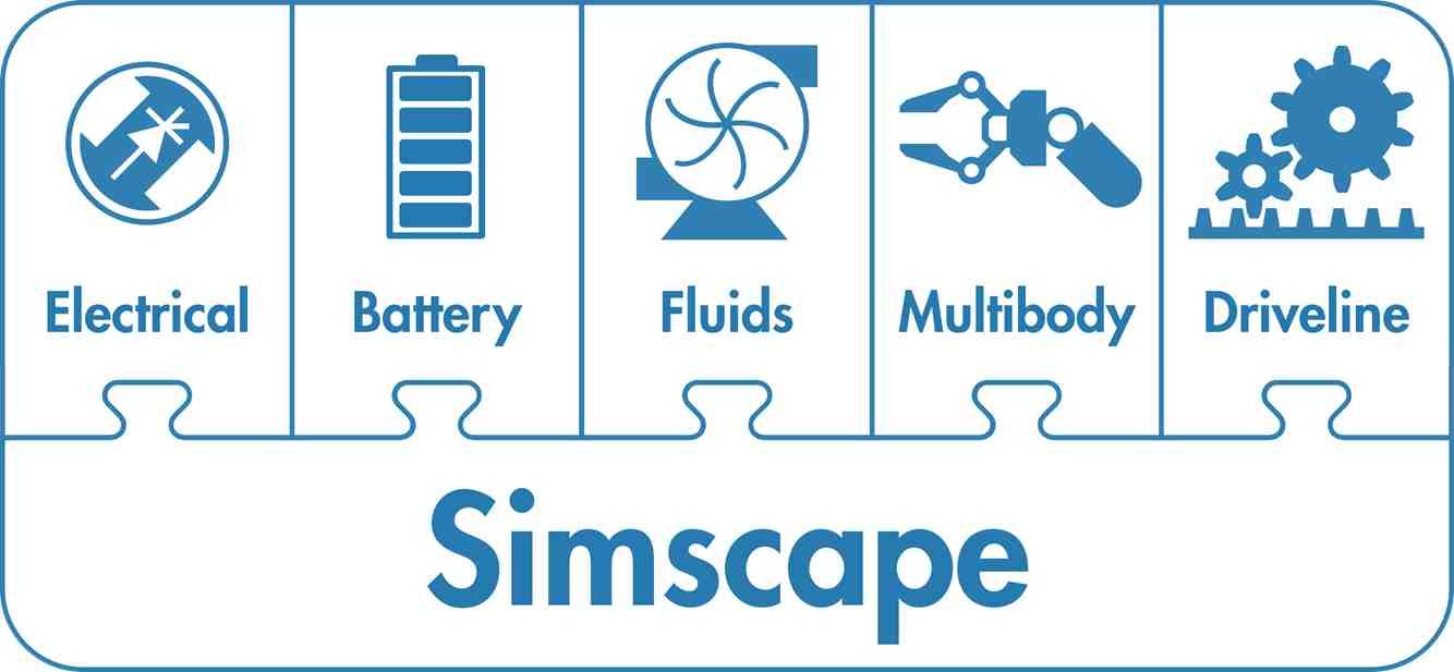
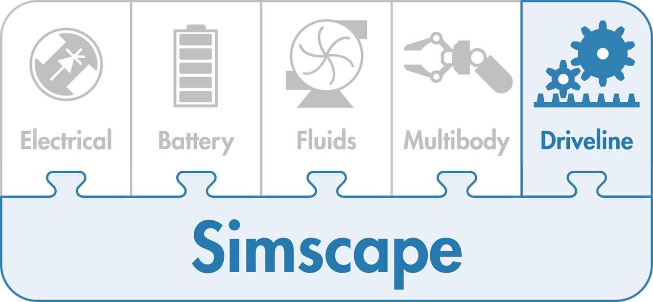
- Simscape
- Simscape Battery
- Simscape Driveline
- Simscape Electrical
- Simscape Fluids
- Simscape Multibody
- Simulink 3D Animation
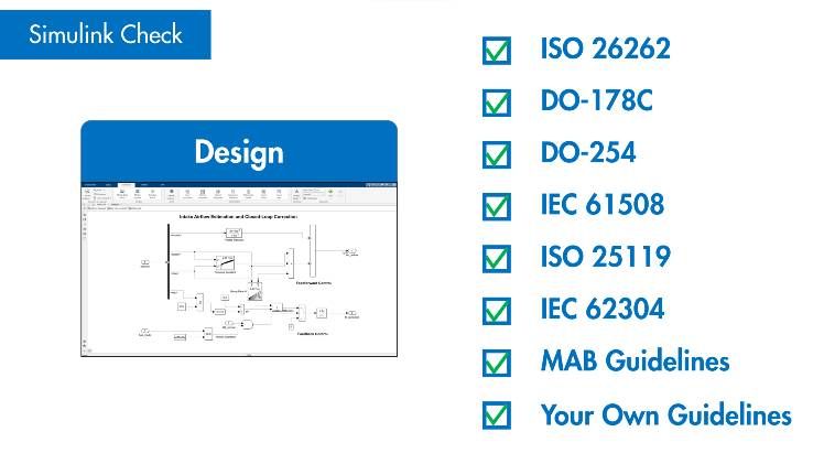
- Simulink Check
- Simulink Code Inspector
- Simulink Coder
- Simulink Compiler
- Simulink Control Design
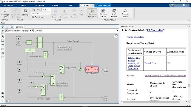
- Simulink Coverage
- Simulink Design Optimization
- Simulink Design Verifier
- Simulink Desktop Real-Time
- Simulink Fault Analyzer
- Simulink PLC Coder
- Simulink Real-Time
- Simulink Report Generator
- Simulink Test
- SoC Blockset
- Spreadsheet Link
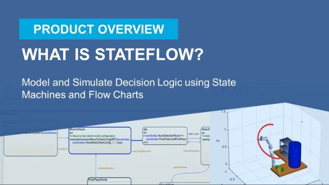
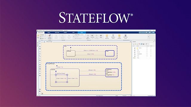
- Stateflow
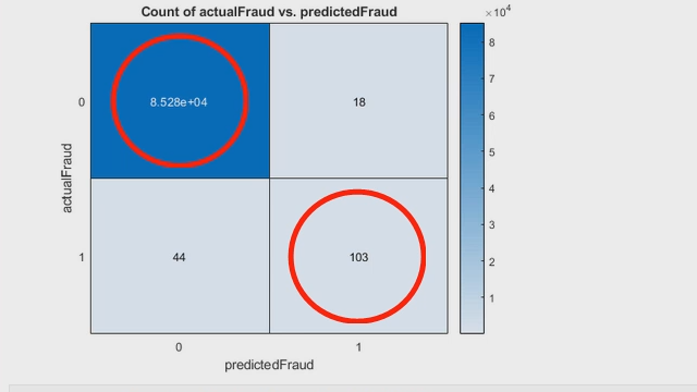
- Statistics and Machine Learning Toolbox
- Symbolic Math Toolbox
- System Composer
- System Identification Toolbox
- Text Analytics Toolbox
- ThingSpeak
- UAV Toolbox
- Vehicle Dynamics Blockset
- Vehicle Network Toolbox
- Vision HDL Toolbox
- Wavelet Toolbox
- Wireless HDL Toolbox
- Wireless Testbench
- WLAN Toolbox