Customizing the Block Name and Appearance
Default Block Display
When you generate a custom block from a Simscape™ component file, the block name and the parameter and variable names in the block dialog box are derived from the component file elements. The default block icon is a rectangle displaying the block name. Ports are based on the nodes, inputs, and outputs defined in the component file.
The following example shows a component file, named spring.ssc,
and the resulting library block and dialog box.
component spring
  nodes
    r = foundation.mechanical.rotational.rotational;
    c = foundation.mechanical.rotational.rotational;
  end
  parameters
    k = { 10, 'N*m/rad' };
  end
  variables
    theta = { 0, 'rad' };
    t = { 0, 'N*m' };
    w = { 0, 'rad/s' };
  end
  branches
    t : r.t -> c.t;
  end
  equations
    assert(k>0)
    w == r.w - c.w;
    t == k * theta;
    w == der(theta);
  end
end
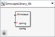
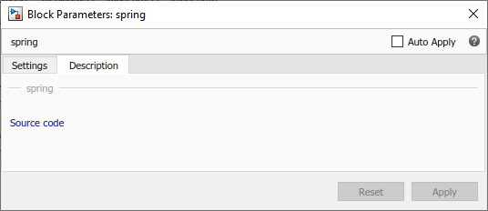
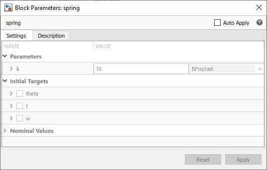
If you click the Source code link, the
spring.ssc file opens in the MATLAB® Editor window.
The following sections show you how to annotate the component file to improve the block cosmetics. You can provide meaningful names for the block itself and for its parameters and variables in the dialog box, as well as supply a short description of its purpose. You can also substitute a custom block icon for the default image and change the names and the default orientation of the ports.
Customize the Block Name
To provide a more descriptive name for the block than the name of the component
file, put it on a separate comment line just below the component
declaration. The comment line must begin with the % character.
The entire content of this line, following the % character, is
interpreted as the block name and appears exactly like that in the block icon and at
the top of the block dialog box.
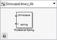
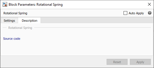
For example, if you have the following component file:
component spring
%Rotational Spring
...
end
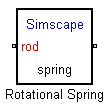
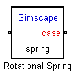
these are the resulting block icon and dialog box:
Describe the Block Purpose
The previous section
describes how the comment line immediately following the
component declaration is interpreted as the block name. Any
additional comments below that line are interpreted as the block description. You
can have more than one line of description comments. Each line must be no longer
than 80 characters and must begin with the % character. The
entire content of description comments will appear in the block dialog box and in
the Library Browser.
For example, if you have the following component file:
component spring
%Rotational Spring
% This block implements a simple rotational spring.
...
end
this is the resulting block dialog box:

To create a paragraph break in the block description, use a blank commented line:
% end of one paragraph
%
% beginning of the next paragraph
Specify Meaningful Names for the Block Parameters and Variables
You can specify the name of a block parameter, the way you want it to appear in
the block dialog box, as a comment immediately following the parameter declaration.
It can be located on the same line or on a separate line. The comment must begin
with the % character.
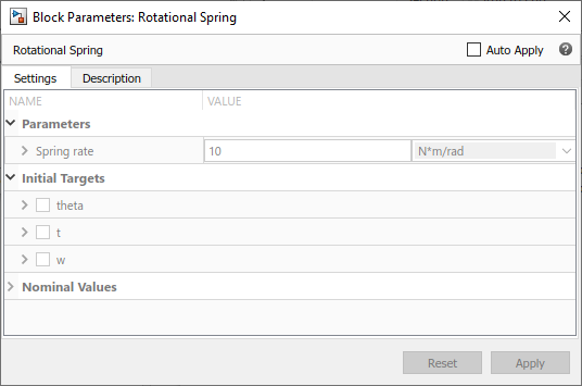
For example, if you have the following component file:
component spring
%Rotational Spring
% This block implements a simple rotational spring.
...
 parameters
    k = { 10, 'N*m/rad' }; % Spring rate
 end
...
end
this is the resulting block dialog box:
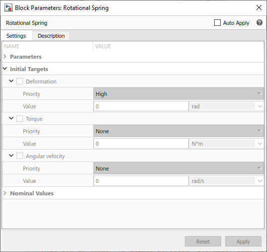
Use the same technique to specify meaningful names for the top-level public variables of the component. These variables appear in the Initial Targets section of the block dialog box, and giving them descriptive names helps with the block-level variable initialization prior to simulation.
For example, if you have the following component file:
component spring
%Rotational Spring
% This block implements a simple rotational spring.
...
  variables
    theta = { value = { 0 , 'rad' }, priority = priority.high }; % Deformation
    t = { 0, 'N*m' };   % Torque
    w = { 0, 'rad/s' }; % Angular velocity
  end
...
end
the resulting Initial Targets section of the block dialog box looks like this:
Group and Reorder Block Parameters Using Annotation
By default, custom block generated from a component has all the component
parameters with ExternalAccess=modify listed in declaration order
in a single tab, titled Parameters. If there are variables with
ExternalAccess=modify, the block dialog also contains a
separate Variables tab. Similarly, in the Property Inspector,
parameters and variables are listed in declaration order in two separate tree nodes,
Parameters and Variables.
For complex components with large numbers of parameters, you can enhance the block
usability by grouping parameters based on their function or on the effect that they
model. For example, you can separate electrical and mechanical parameters for a
motor, or place all temperature-dependent parameters in a separate group. You do
this by using the block layout annotation,
UILayout.
UILayout annotation lets you define titled
groups of component parameters, the order of these groups, and the order of
parameters in each group. When you deploy the component as a custom Simscape block, these groups translate into dialog box tabs (and into Property
Inspector tree nodes).
The block layout annotation syntax is:
  annotations
    UILayout = [UIGroup("Title 1",p1,p2)
                UIGroup("Title 2",p3)]
  end
The following rules apply:
UILayoutis a class-level annotation, meaning that it can appear only once per component file.UILayoutannotation must contain a nonempty array ofUIGroupconstructs. The order of the groups defines the order of the dialog box tabs.Each
UIGroupconstruct must include a title string and a nonempty comma-separated list of component parameters. The title string serves as the title of the dialog box tab, and the listed parameters appear on that tab, in list order.Component parameters with
ExternalAccess=modifynot listed in any of the groups appear at the end of the first tab in declaration order.A parameter cannot belong to more than one group. Listing the same parameter in multiple groups results in an error.
This annotation does not affect component variables. Whether you use the block layout annotation or not, variables are listed on a separate Variables tab in declaration order.
Use the block layout annotation to:
Create multiple tabs in a block dialog box. To do this, define multiple groups of parameters. Each group is displayed on a separate tab.
Change the parameter order in the block dialog box, compared to the declaration order. To do this, define one group of parameters, titled
"Parameters", and list the component parameters in desired order.
This feature makes authoring the component source independent of the resulting block layout. You can arrange parameter declaration blocks in a way that helps code readability, and later reorder parameters in the block interface, as needed. For a detailed example, see Use Advanced Techniques to Customize Block Display.
Customize the Names and Locations of the Block Ports
Block ports, both conserving and Physical Signal, are based on the nodes, inputs, and outputs defined in the component file. The default port label corresponds to the name of the node, input, or output, as specified in the declaration block. The default location of all ports is on the left side of the block icon. The ports are spread equidistantly along the block side.
There are two ways to control the port label and location in the block icon:
Use separate controls for port labels and locations. This is the recommended way because it provides more flexibility. Specify the port labels by using comments immediately following the node, input, or output declaration, similar to specifying meaningful names for parameters and variables. Specify the port side separately, by using the
annotationssection in the component file. For more information, see Customize Port Labels on the Block Icon and Control Port Locations Using Annotations.Use comments immediately following the node, input, or output declaration, to specify both the name and location of the block port. This is a legacy method that allows you to have ports only on two opposite sides of the block icon (left and right, or top and bottom). For more information, see Use Comments to Control Port Locations.
Customize Port Labels on the Block Icon
The default port label corresponds to the name of the node, input, or output, as specified in the declaration block. Similar to specifying meaningful names for block parameters and variables, you can customize a port label by supplying a comment immediately following the node, input, or output declaration. For example:
  nodes
    p = foundation.electrical.electrical; % +
    n = foundation.electrical.electrical; % -
  end
If you specify an empty comment string after a node, input, or output
declaration, the corresponding port will not have its name displayed. For
example, the following syntax suppresses the port label for the physical signal
input port PS:
  inputs
     PS; %
  end
Control Port Locations Using Annotations
Use the annotations section in the
component file to specify the port locations. For example:
  nodes
    H = foundation.thermal.thermal;
    p = foundation.electrical.electrical; % +
    n = foundation.electrical.electrical; % -
  end
  annotations
    H : Side = top;
    p : Side = left;
    n : Side = right;
  end
Rules and restrictions:
You can use
Sideannotations for nodes, inputs, and outputs.Member attributes must be uniquely defined. Therefore, you cannot use the same member ID on the left side of the
Sideannotations more than once.nodes p = foundation.electrical.electrical; n = foundation.electrical.electrical; end annotations [p, n] : Side = left; n : Side = right; % error: multiple definitions for 'Side' of port 'n' endIf you specify different locations for the same port by using both the annotations and the comments, the location in the
annotationssection takes precedence.outputs o = {0, 'V'}; %o:right end annotations o : Side = top; % annotation takes precedence, so port will be located on the top endYou can use the same member ID multiple times to declare different annotation attributes.
nodes
    n1 = foundation.electrical.electrical;
    n2 = foundation.electrical.electrical;
    n3 = foundation.electrical.electrical;
end
annotations
    [n1, n2] : ExternalAccess = none;
    [n2, n3] : Side = right;
end
Similarly, you can declare different annotation attributes for the same member ID in one statement.
nodes
    n1 = foundation.electrical.electrical;
    n2 = foundation.electrical.electrical;
    n3 = foundation.electrical.electrical;
end
annotations
    [n1, n2] : ExternalAccess = none, Side = top;
    n3 : Side = right;
end
You cannot conditionally switch port sides, that is, include
Sideannotations in branches of a conditional statement.parameters thermal_effects = false; % Model thermal effects? end nodes (ExternalAccess=none) H = foundation.thermal.thermal; end if thermal_effects % Expose thermal port annotations H : ExternalAccess = modify; H : Side = bottom; % error: cannot have 'Side' annotations inside conditional sections end endTo place a conditionally visible port on a specific side of the block (for example, on the bottom), use the following syntax:
parameters
    thermal_effects = false; % Model thermal effects?
end
nodes (ExternalAccess=none)
   H = foundation.thermal.thermal;
end
annotations
   H : Side = bottom;
end
if thermal_effects
  % Expose thermal port
    annotations
       H : ExternalAccess = modify;
    end
end
Use Comments to Control Port Locations
Note
This is a legacy method that has multiple limitations. Therefore, the
recommended method is to use the
annotations section, as described
in Control Port Locations Using Annotations.
You can also use a comment that immediately follows the node, input, or output
declaration to specify both the port label and location. The comment can be on
the same line or on a separate line. The comment must begin with the
% character and be of the format
label:location, where label is a
string corresponding to the input port name in the block diagram, and
location is one of the following strings:
left, right, top,
bottom. You can locate all ports either on one side of
the block or on two opposite sides, for example left and right, or top and
bottom. You can omit the location if you want to keep the default location of
the port (on the left side).
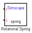
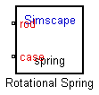
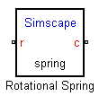
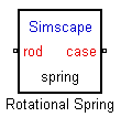
You can also leave the port label field empty and specify just the location. In this case, the port will not have its name displayed. For example, the following syntax suppresses the port label and locates it on the top of the block icon:
r = foundation.mechanical.rotational.rotational; % :topIf you specify an empty comment string after a node, input, or output declaration, the corresponding port will not be labeled and will be located on the left side of the block icon.
The following are examples of node declarations and the resulting block icons.
| Syntax | Block Icon |
|---|---|
|
|
|
|
|
|
|
|
|
|
|
|
Customize the Block Icon
The default block icon is a rectangle displaying the block name. You can replace
this default icon with a custom image file. For information on supported file
formats and image properties, see Supported File Formats. For
information on using the Simulink® Graphical Icon Editor to produce a custom image file in
svg format, see Using the Graphical Icon Editor.
Once you have the image file, there are two ways to specify a custom block icon:
Explicitly, using the
annotationssection in the component file. This is the recommended way because it provides more flexibility. You can keep the image files in a separate folder and specify relative paths for the block icons. You can also specify conditional custom icons for different block variants. For more information, see Using Annotations.Implicitly, using the file naming conventions. This method is convenient if you ship complete library namespaces to customers. For more information, see Using File Naming Conventions.
Using Annotations
Use the annotations section in the
component file to specify the name of the custom block icon. The file name must
contain the file extension. For example:
  annotations
    Icon = 'custom_spring.jpg';
  end
The file name can include a relative path from the folder containing the component file to the folder containing the image file, for example:
  annotations
    Icon = '../../block_icons/custom_spring.jpg';
  end
The annotations section also lets you
specify conditional custom icons. This is especially useful if the number of
ports changes for different variants. For example:
component MyPipe
  parameters
    thermal_variant = false; % Model thermal effects?
  end
  if thermal_variant
  % Use icon with additional thermal port
    annotations
       Icon = 'pipe_thermal.jpg';
    end
  else
  % Use regular icon, with two fluid ports
    annotations
       Icon = 'pipe.jpg';
    end
  end
  [...] % Other parameters, variables, nodes, branches, equations
end
Using File Naming Conventions
Instead of explicitly specifying a custom block icon using the
annotations section, you can do it
implicitly, by placing an image file with the same name as the component in the
folder containing the component file.
This method is convenient if you ship complete library namespaces to
customers. For example, if the subnamespace containing the component file
spring.ssc also contains a file named
spring.jpg, then that image file is automatically used
for the icon representing this block in the custom library.
The implicit rules for using custom block icons are:
If the
annotationssection does not explicitly specify a custom icon image, or if that image is not found, the software looks in the folder containing the component file for an image file with the same name as the component.If there are multiple image files with the same name, the formats take precedence in the order listed in Supported File Formats. For example, if the subnamespace contains both
spring.jpgandspring.bmp,spring.jpgis the image that will appear in the custom library.
Supported File Formats
The following image file formats are supported for custom block icons:
svgjpgbmppng
Caution
Using svg format together with domain-specific line
styles can lead to unexpected results, because domain line styles and colors
can propagate to parts of the custom block icon. For more information on
turning domain-specific line styles on and off, see Domain-Specific Line Styles. This restriction does not apply to
block icons created using the Graphical Icon Editor, because these
svg images correctly propagate domain colors. For
more information, see Using the Graphical Icon Editor.
The image type must be an RGB (truecolor) image, stored as an m-by-n-by-3 data array.
Specifying Scaling and Rotation Properties of the Custom Block Icon
When you use an image file to represent a component in the custom block library, the following syntax in the component file lets you specify the scaling and rotation properties of the image file:
component name
% [ CustomName [ : scale [ : rotation ] ] ]
...
where
| Component name |
| Customized block name, specified as described in Customize the Block Name. Leading and trailing white spaces are removed. |
| A scalar number, for example, You cannot specify MATLAB expressions for the scale, just numbers. |
| Specifies whether the block icon rotates with the block:
|
For example, the following syntax
component spring
% Rotational Spring : 0.5 : fixed
specifies that the spring image size is scaled to half of its default size and always stays in its default orientation, regardless of the block rotation.
Using the Graphical Icon Editor
You can use the Graphical Icon Editor to view and edit block icons for Simscape blocks.
To open the editor, select a custom block in a model or in a custom block library and, at the MATLAB command prompt, type:
Simulink.IconEditor.open(gcb)
Draw the icon using the elements in the Tools pane. This pane contains basic shapes, textual elements, and common physical element symbols, such as resistor, diode, inertia, and so on. For example, to create a custom icon for the rotational spring block, scroll down to the Rotational section and select the Rotational Spring element, then draw it in the central pane of the editor window.
![]()
For more information on using the Graphical Icon Editor, see Graphical Icon Editor Overview.
When satisfied with the icon, click Save.
A window with the instructions for saving the icon opens. Click Yes.
Save the icon as spring.svg in the same folder as the
component file. Or save it with a different name and add the annotation to the
component file. For example, save the icon as
custom_spring.svg and add the annotation to the
spring.ssc file:
  annotations
    Icon = 'custom_spring.svg';
  end
Note
The Graphical Icon Editor lets you save the file in
svg format only.
You can also view and edit the block icon by using the options on the Simscape Block tab, in the Source section:
Add icon — This option is available when you select a custom Simscape block that does not have a custom icon.
Edit icon — This option is available when you select a custom Simscape block that does have a custom icon associated with it.
View icon — This option is available when you select a Simscape block from a library. The Icon Editor opens in read-only state to let you view the block icon.
![]()
