Plot Temperature and Wind Speed on Two Different Axes
This example shows how to read two types of data from an existing ThingSpeak™ channel and generate a line plot with two independent y-axes. In the example, you modify one of the code templates provided by the MATLAB Analysis and MATLAB Visualizations apps. ThingSpeak channel 12397 contains weather data from a weather station on top of a parking garage on the MathWorks® campus in Natick, MA.
Create a MATLAB Visualization from Template Code
To create a visualization of temperature and wind speed from a ThingSpeak channel, you can write a MATLAB® script using code template provided in the MATLAB Visualizations app.
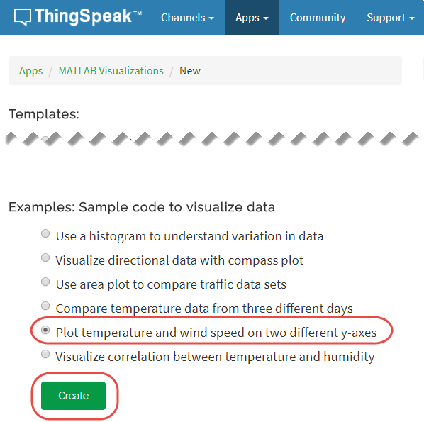
Go to the Apps tab and select MATLAB Visualizations. Click New, select Plot temperature and wind speed of two different y-axes, and click Create.
Visualize Your Data
ThingSpeak populates the MATLAB Code field with the code to generate a two-axis plot.
1) Set the variables for communicating with ThingSpeak. In this example, the Read API Key is unnecessary because the weather station channel is public. Assign a value to readAPIKey only if you are reading data from your own private channel instead of the weather station channel.
readChannelID = 12397;
TemperatureFieldID = 4;
windSpeedFieldID = 2;
readAPIKey = '';
2) Use thingSpeakRead to retrieve 300 points of temperature and wind speed data.
[data, timeStamps ] = thingSpeakRead(readChannelID,'Fields',[TemperatureFieldID windSpeedFieldID], 'NumPoints',300,'ReadKey',readAPIKey);
3) Extract the temperature and wind speed data.
temperatureData = data(:, 1);
windSpeedData = data(:, 2);
4) Use plot (MATLAB) and yyaxis (MATLAB) to generate the two-axis plot. Set the y-axis labels for each side using ylabel (MATLAB).
yyaxis left
plot(timeStamps, temperatureData);
ylabel('Temperature');
yyaxis right
plot(timeStamps, windSpeedData);
ylabel('Wind Speed');
5) You can edit the template code to fit your application. For example, you can edit the number of points to read and the plot titles in the code. Click Save and Run to generate the plot.
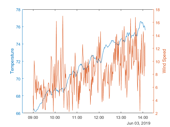
Since the plot is generated from real-time data, your plot looks similar but not identical to this plot.
See Also
Functions
mean(MATLAB) |plot(MATLAB) |yyaxis(MATLAB) |ylabel(MATLAB) |thingSpeakRead