Use Partial Dependence Plots to Interpret Classifiers Trained in Classification Learner App
For trained classification models, partial dependence plots (PDPs) show the relationship between a predictor and the predicted class scores. The partial dependence on the selected predictor is defined by the averaged prediction obtained by marginalizing out the effect of the other predictors.
This example shows how to train classification models in the Classification Learner app and interpret the best-performing models using PDPs. You can use PDP results to confirm that models use features as expected, or to remove unhelpful features from model training.
In the MATLAB® Command Window, load the
carbigdata set, which contains measurements of cars made in the 1970s and early 1980s.load carbigCategorize the cars based on whether they were made in the USA.
Origin = categorical(cellstr(Origin));
Origin = mergecats(Origin,["France","Japan","Germany", ...
    "Sweden","Italy","England"],"NotUSA");
Create a table containing the predictor variables
Acceleration,Displacement, and so on, as well as the response variableOrigin.cars = table(Acceleration,Displacement,Horsepower, ... Model_Year,MPG,Weight,Origin);Remove rows of
carswhere the table has missing values.cars = rmmissing(cars);
Open Classification Learner. Click the Apps tab, and then click the arrow at the right of the Apps section to open the apps gallery. In the Machine Learning and Deep Learning group, click Classification Learner.
On the Learn tab, in the File section, click New Session and select From Workspace.
In the New Session from Workspace dialog box, select the
carstable from the Data Set Variable list. The app selects the response and predictor variables. The default response variable isOrigin. The default validation option is 5-fold cross-validation, to protect against overfitting.In the Test section, click the check box to set aside a test data set. Specify
15percent of the imported data as a test set.To accept the options and continue, click Start Session.
Train all preset models. On the Learn tab, in the Models section, click All. In the Train section, click Train All and select Train All. The app trains one of each preset model type, along with the default fine tree model, and displays the models in the Models pane.
Note
If you have Parallel Computing Toolbox™, then the Use Parallel button is selected by default. After you click Train All and select Train All or Train Selected, the app opens a parallel pool of workers. During this time, you cannot interact with the software. After the pool opens, you can continue to interact with the app while models train in parallel.
If you do not have Parallel Computing Toolbox, then the Use Background Training check box in the Train All menu is selected by default. After you select an option to train models, the app opens a background pool. After the pool opens, you can continue to interact with the app while models train in the background.
Sort the trained models based on the validation accuracy. In the Models pane, open the Sort by list and select
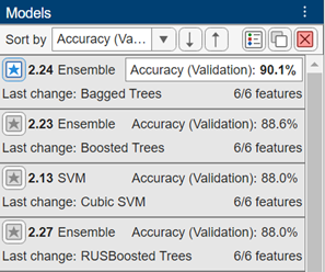
Accuracy (Validation).In the Models pane, click the star icon next to the model with the highest validation accuracy. The app highlights the highest validation accuracy by outlining it in a box. In this example, the trained Bagged Trees model has the highest validation accuracy.

Note
Validation introduces some randomness into the results. Your model validation results might vary from the results shown in this example.
For the starred model, you can check the model performance by using various plots (for example, scatter plots, confusion matrices, ROC curves, and precision-recall curves). In the Models pane, select the model. On the Learn tab, in the Plots and Results section, click the arrow to open the gallery. Then, click any of the buttons in the Validation Results group to open the corresponding plot.
After opening multiple plots, you can change the layout of the plots by using the Document Actions button located to the far right of the model plot tabs. For example, click the button, select the
Sub-Tileoption, and specify a layout. For more information on how to use and display validation plots, see Visualize and Assess Classifier Performance in Classification Learner.
To return to the original layout, you can click the Layout button in the Plots and Results section and select Single model (Default).
For the starred model, see how the model features relate to the model predictions by using partial dependence plots (PDPs). On the Explain tab, in the Global Dependence section, click Partial Dependence. The PDP allows you to visualize the marginal effect of each predictor on the predicted scores of the trained model. To compute the partial dependence values, the app uses the model trained on the 85% of observations in
carsnot reserved for testing.Examine the relationship between the model predictors and model scores on the training data (that is, 85% of the observations in
cars). Under Data, select Training set.Look for features that seem to contribute to model predictions. For example, under Feature, select
Displacement.
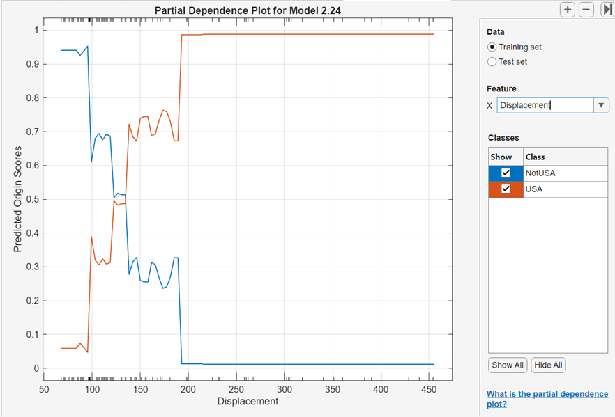
The blue plotted line represents the averaged partial relationship between the
Displacementfeature and theNotUSApredicted scores. The red plotted line represents the averaged partial relationship between theDisplacementfeature and theUSApredicted scores. The tick marks along the x-axis indicate the uniqueDisplacementvalues in the training data set.According to this model (Model 2.24), the probability of a car originating in the USA tends to increase as its engine displacement increases. In particular, the probability of a car originating outside of the USA drops to almost 0 when the engine displacement is greater than 200. Notice, however, that few cars have a displacement value greater than 200.
Note
In general, consider the distribution of values when interpreting partial dependence plots. Results tend to be more reliable in intervals where you have sufficient observations whose predictor values are spread evenly.
You can tune your best-performing model by removing predictors that do not seem to contribute to model predictions. For example, in the partial dependence plot for the starred model, select
Model_Yearunder Feature.
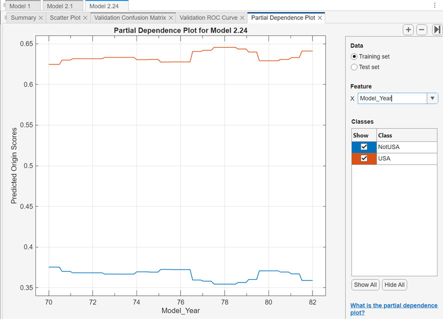
The predicted scores do not seem to vary greatly as the model year increases. This result does not necessarily imply that the predictor is an unimportant feature. Because the
Model_Yearvariable contains only integer values, the x-axis tick marks cannot fully reflect the distribution of the predictor values; that is, the values might be sparsely or unevenly distributed across the range of model years.Although you cannot determine that
Model_Yearis an unimportant feature, you might expect the model year to have limited influence on the car origin. Therefore, you can try removing theModel_Yearpredictor. In general, you do not need to remove predictors that contribute to predictions as expected.For this example, remove the
Model_Yearpredictor from the best-performing model. For the starred model, create a copy of the model. Right-click the model in the Models pane, and select Duplicate.Then, in the model Summary tab, expand the Feature Selection section, and clear the Select check box for the Model_Year feature.

Train the new model. In the Train section of the Learn tab, click Train All and select Train Selected.
In the Models pane, click the star icon next to the new model. To group the starred models together, open the Sort by list and select
Favorites.For each starred model, compute the accuracy of the model on the test set. First, select the model in the Models pane. Then, on the Test tab, in the Test section, click Test Selected.
Compare the validation and test accuracy results for the starred models by using a table. On the Test tab, in the Plots and Results section, click Results Table. In the Results Table tab, click the Select Columns button above the table.
In the Select Columns to Display dialog box, check the Select box for the Preset column, and clear the Select check boxes for the Total Cost (Validation) and Total Cost (Test) columns. Click OK.

In this example, the original Bagged Trees model (Model 2.24) outperforms the other starred model in terms of validation and test accuracy.
For the best-performing model, look at the PDPs on the test data set. Ensure that the partial relationships meet expectations.
For this example, compare the training set and test set PDPs for the
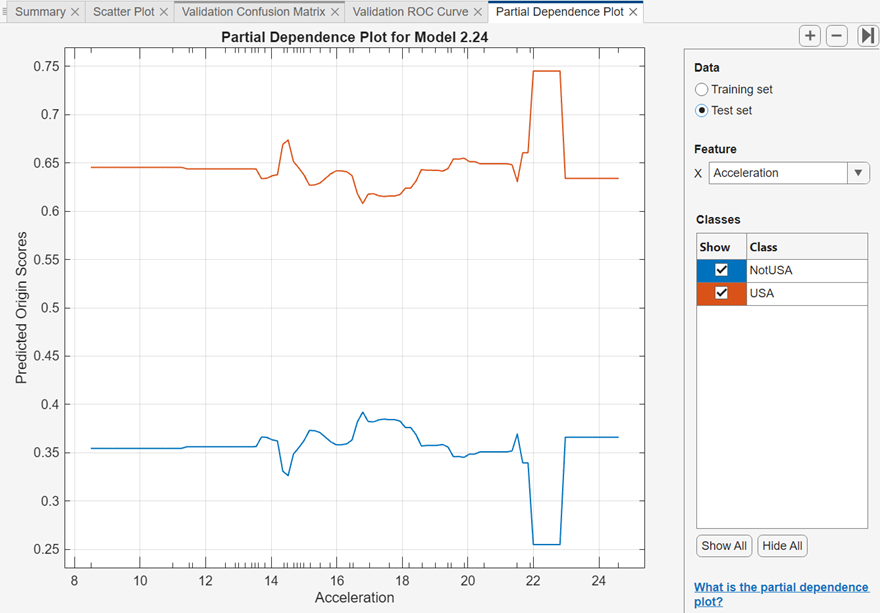
Accelerationfeature and the Model 2.24 predicted scores. On the Explain tab, in the Global Dependence section, click Partial Dependence. Under Feature, selectAcceleration. Under Data, select Training set and then select Test set to see each plot.

The PDPs are similar for the training and test data sets. For lower acceleration values, the predicted scores remain fairly consistent. The scores begin to change noticeably at an acceleration value of approximately 22.
If you are satisfied with the best-performing model, you can export the trained model to the workspace. For more information, see Export Model to Workspace. You can also export any of the partial dependence plots you create in Classification Learner. For more information, see Export Plots in Classification Learner App.
See Also
plotPartialDependence | partialDependence