Design Custom Rocker, Slider, and Toggle Switches
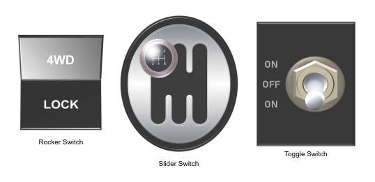
This example shows how to use the customizable Rocker Switch, Slider Switch, and Toggle Switch blocks to design three switches that look like controls in real systems:
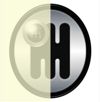
A diff lock switch to lock the differential in a passenger vehicle, modeled as a rocker switch
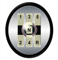
An automotive gearbox modeled as a slider switch
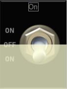
An electromechanical toggle switch
Every switch has multiple states. A state pairs a State Value with a customizable State Label and block appearance. The block appearance of a state can, for example, include an image that appears on the block between the background and foreground or a particular font color for the State Label.
You can activate a state by clicking its click area. When you activate the state, the State Value is assigned to the Simulink® block diagram element to which the switch block is connected.
The blocks in the model use PNG images to define the appearance of states. You can find all images used to create the switches in the example directory.
Design Diff Lock Rocker Switch
To design the diff lock switch, add a customizable Rocker Switch block to the model using the Simulink quick insert menu:
To open the quick insert menu, double-click in the canvas.
To search for the customizable Rocker Switch block, type
Rocker Switch.Select the search result with the library path
Simulink/Dashboard/Customizable Blocks.
To modify the design of the Rocker Switch block, enter design mode:
In the model canvas, select the Rocker Switch block.
In the Simulink Toolstrip, click the Switch tab.
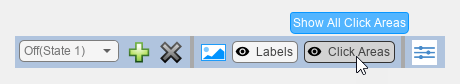
On the Switch tab, click Edit. A toolbar appears above the Rocker Switch block.
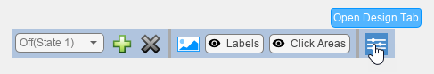
To open the Property Inspector, in the toolbar, click Open Design Tab. In design mode, the Design tab of the Property Inspector is active.
You can design a custom switch using the toolbar or using the Design tab of the Property Inspector. This example uses both.
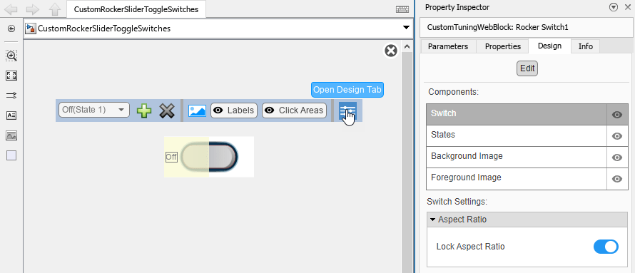
Adding state images to a customizable dashboard block changes the aspect ratio of the state images to match the aspect ratio of the block.
Adding a background image to a customizable dashboard block changes the aspect ratio of the block to match the aspect ratio of the background image.
To prevent state images from being distorted, before you add the state images, you can use a transparent background image to set the aspect ratio of the block to be the same as the aspect ratio of the state image.
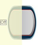
Add the transparent background image for the diff lock switch:
On the Design tab, select the Background Image component.
In the Select Image section, click the plus button.
In the
CustomRockerSliderToggleSwitchImagesfolder, select thediff-lock-switch-background.pngfile.
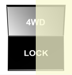
The Rocker Switch block for the diff lock switch has two states:
In State 1, the car is in four-wheel drive mode. The Rocker Switch block has a State Value of
0and the State Label4WD.In State 2, the differential is locked. The Rocker Switch block has a State Value of
1and the State LabelLock.
When the Rocker Switch block is in State 1, the half of the diff lock switch with the 4WD label is pressed down.
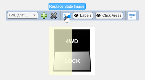
Configure the appearance of the diff lock switch for State 1:
On the Design tab, select the States component. The Value of the state is
0by default.To make the state identifiable in the Select State section drop-down list, in the Label section, enter the State Label
4WDin the Text field. When you click out of the Text field, the label appears in the Select State section drop-down list.Since the diff lock switch settings are labeled in the background image, the block labels are redundant. In the Label section, turn off Show Label.
In the toolbar, click Replace State Image.
In the
CustomRockerSliderToggleSwitchImagesfolder, select thediff-lock-switch-4wd.pngfile.
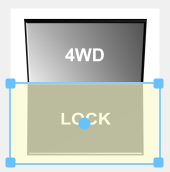
To configure the Click Area for State 1, in the canvas, click and drag the corners of the yellow rectangle to cover the upper half of the state image.

When the Rocker Switch block is in State 2, the half of the diff lock switch with the LOCK label is pressed down.
Configure the appearance of the diff lock switch for State 2:
In the Select State section, select
On (State 2). The Value of the state is1by default.In the Label section, enter the State Label
Lockin the Text field.In the Label section, turn off Show Label.
In the toolbar, click Replace State Image.
In the
CustomRockerSliderToggleSwitchImagesfolder, select thediff-lock-switch-lock.pngfile.
To configure the Click Area for State 2, in the canvas, click and drag the corners of the yellow rectangle to cover the lower half of the state image. To avoid overlap between the click areas of the first and second states, in the toolbar, click Show All Click Areas. You can now see the click areas of all states while editing the click area of the active state.
When you finish adjusting the design for the diff lock switch, to exit design mode, in the Property Inspector, on the Design tab, click Edit.
You can use the finished diff lock switch to control a parameter. In the model, a Constant block represents the mode of operation of the differential, and the Rocker Switch block controls the value of the constant.

Connect the Rocker Switch block to the Value parameter of the Constant block:
Select the Rocker Switch block.
Click the Connect button that appears above the block.
Select the Constant block named
Const1.In the table that appears below the selected signal, select
Const1:Value.Click the
Xin the upper right corner of the Simulink window.
To use the diff lock switch:
Simulate the model. This model uses simulation pacing to slow model execution so you can interact with the model during simulation. For more information about simulation pacing, see Simulation Pacing Options.
During simulation, click the upper or on the lower half of the background image to flip the rocker switch.
See the effect on the mode of operation of the differential in the Dashboard Scope block.
Design Gearbox Modeled as Slider Switch
To design the automotive gearbox, add a customizable Slider Switch block to the model.
If the Property Inspector is not open to the Design tab with the Edit button pressed:
In the model canvas, select the Slider Switch block.
In the Simulink Toolstrip, click the Switch tab.
On the Switch tab, click Edit. A toolbar appears above the Slider Switch block.
To open the Property Inspector, in the toolbar, click Open Design Tab.
Add the background image for the gearbox:
In the Property Inspector, on the Design tab, select the Background Image component.
In the Select Image section, click the plus button.
In the
CustomRockerSliderToggleSwitchImagesfolder, select thegearbox-background.pngfile.

The Slider Switch block for the gearbox has seven states:
In State 1, the car is in first gear. The Slider Switch block has a State Value of
1and the State LabelFirst Gear.In State 2, the car is in second gear. The Slider Switch block has a State Value of
2and the State LabelSecond Gear.In State 3, the car is in third gear. The Slider Switch block has a State Value of
3and the State LabelThird Gear.In State 4, the car is in fourth gear. The Slider Switch block has a State Value of
4and the State LabelFourth Gear.In State 5, the car is in fifth gear. The Slider Switch block has a State Value of
5and the State LabelFifth Gear.In State 6, the car is in reverse. The Slider Switch block has a State Value of
-1and the State LabelReverse.In State 7, the car is in neutral. The Slider Switch block has a State Value of
0and the State LabelNeutral.
When the Slider Switch block is in State 1, the gear lever is in the upper left slot of the gearbox.
Configure the appearance of the gearbox for State 1:
On the Design tab, select the States component.
The default Slider Switch block has two states. Since multiple states cannot be assigned the same State Value, before assigning the value for State 1, check the value for State 2 by expanding the Select State menu and selecting
On (State 2).The State Value of State 2, shown in the Value section, is
1, but the State Value for State 1 of the diff lock switch is also1. To change the State Value of State 2, in the Value section, set Value to2.To configure State 1, in the Select State menu, select
Off (State 1).To make the state identifiable in the Select State section drop-down list, in the Label section, enter the State Label
First Gearin the Text field. When you click out of the Text field, the label appears in the Select State section drop-down list.Since the gears are labeled on the gearstick in the background image, the block labels are redundant. In the Label section, turn off Show Label.
In the toolbar, click Replace State Image.
In the
CustomRockerSliderToggleSwitchImagesfolder, select thegearbox-gear-1.pngfile.
To exit design mode, on the Design tab, click Edit. Resize the block in the canvas by dragging one of its corners outwards until the numbers on the gear lever are large enough to read.
To reenter design mode, in the Property Editor, on the Design tab, click Edit.
To configure the Click Area for State 1, in the canvas, click and drag the corners of the yellow rectangle to cover the upper left slot on the gearbox in the background image.

To configure the other five states, for each state:
In the Property Inspector, on the Design tab, in the States component, in the Select State section, expand the drop-down list. If the state number is listed, select the corresponding state. If not, click the plus button to add a new state.
In the Value section, enter the
State Value.In the Label section, enter the
State Labelin the Text field.If a
State Labelis visible in the canvas, in the Label section, turn off Show Label.In the toolbar, click Replace State Image.
In the
CustomRockerSliderToggleSwitchImagesfolder, select thegearbox-gear-N.pngfile, whereNis the number of the gear. For reverse, select thegearbox-reverse.pngfile, and for neutral, select thegearbox-neutral.pngfile.To configure the click area, in the canvas, click and drag the corners of the yellow rectangle. Use the image as a guide to size and position the click area. To avoid overlap between the click areas of different states, in the toolbar, click Show All Click Areas. You can now see the click areas of all states while editing the click area of the active state.
When you finish adjusting the design for the gearbox, to exit design mode, in the Property Inspector, on the Design tab, click Edit.
You can use the finished gearbox to control a parameter. In the model, a Constant block represents the gear of a car. The Slider Switch block controls the value of the constant.

Connect the Slider Switch block to the Value parameter of the Constant block:
Select the Slider Switch block.
Click the Connect button that appears above the block.
Select the Constant block named
Const2.In the table that appears below the selected signal, select
Const2:Value.Click the
Xin the upper right corner of the Simulink window.
To use the gearbox:
Simulate the model. This model uses simulation pacing to slow model execution so you can interact with the model during simulation. For more information about simulation pacing, see Simulation Pacing Options.
During simulation, click the area of the background image to which you want to move the gear lever to change gears during simulation.
See the effect on the gear in the Dashboard Scope block.
Design Electromechanical Toggle Switch
To design the electromechanical toggle switch, add a customizable Toggle Switch block to the model.
If the Property Inspector is not open to the Design tab with the Edit button pressed:
In the model canvas, select the Toggle Switch block.
In the Simulink Toolstrip, click the Switch tab.
On the Switch tab, click Edit. A toolbar appears above the Toggle Switch block.
To open the Property Inspector, in the toolbar, click Open Design Tab.
Add the background image for the electromechanical switch:
In the Property Inspector, on the Design tab, select the Background Image component.
In the Select Image section, click the plus button.
In the
CustomRockerSliderToggleSwitchImagesfolder, select thetoggle-background.pngfile.

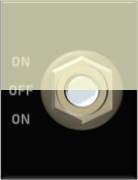
The Toggle Switch block for the electromechanical switch has three states:
In State 1, the switch is on, the toggle is pointing down. The Toggle Switch block has a State Value of
-1and the State LabelOn, Down.In State 2, the switch is off, the toggle is centered. The Toggle Switch block has a State Value of
0and the State LabelOff.In State 3, when the switch is on, the toggle is pointing up. The Toggle Switch block has a State Value of
1and the State LabelOn, Up.
When the Toggle Switch block is in State 1, the toggle is pointing down.
Configure the appearance of the electromechanical switch for State 1:
On the Design tab, select the States component.
In the Value section, set the Value to
-1.To make the state identifiable in the Select State section drop-down list, in the Label section, enter the State Label
On, Downin the Text field. When you click out of the Text field, the label appears in the Select State section drop-down list.Since the settings of the electromechanical switch are labeled in the background image, the block labels are redundant. In the Label section, turn off Show Label.
In the toolbar, click Replace State Image.
In the
CustomRockerSliderToggleSwitchImagesfolder, select thetoggle-down.pngfile.
To exit design mode, on the Design tab, click Edit. Resize the block in the canvas by dragging one of its corners outwards until the labels on the electromechanical switch are large enough to read.
To reenter design mode, in the Property Editor, on the Design tab, click Edit.
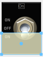
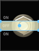
To configure the Click Area for State 1, in the canvas, click and drag the corners of the yellow rectangle to cover the electromechanical switch from the bottom to halfway between the OFF label and the lower ON label.
When the Toggle Switch block is in State 2, the toggle is centered.
Configure the appearance of the electromechanical switch for State 2:
On the Design tab, select the States component.
In the Select State section, select
On (State 2).In the Value section, set the Value to
0.In the Label section, enter the State Label
Offin the Text field.In the Label section, turn off Show Label.
In the toolbar, click Replace State Image.
In the
CustomRockerSliderToggleSwitchImagesfolder, select thetoggle-neutral.pngfile.
To configure the Click Area for State 2, in the canvas, click and drag the corners of the yellow rectangle to cover the switch from halfway between the OFF label and the lower ON label to halfway between the OFF label and the upper ON label. To avoid overlap between the click areas of State 1 and State 2, click Show All Click Areas. You can now see the click areas of all states while editing the click area of the active state.
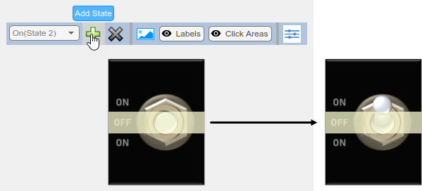
When the Toggle Switch block is in State 3, the toggle is up.
Configure the appearance of the electromechanical switch for State 3:
In the Property Inspector, on the Design tab, select the States component.
To add a new state, in the Select State section, click the plus button.
In the Value section, set the Value to
1.In the Label section, enter the State Label
On, Upin the Text field.In the toolbar, click Replace State Image.
In the
CustomRockerSliderToggleSwitchImagesfolder, select thetoggle-up.pngfile.
To configure the Click Area for State 3, in the canvas, click and drag the corners of the yellow rectangle to cover the switch from the top to halfway between the OFF label and the upper ON label.

When you finish adjusting the design for the electromechanical switch, to exit design mode, in the Property Inspector, on the Design tab, click Edit.
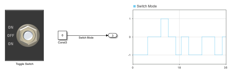
You can use the finished switch to control a parameter. In the model, a Constant block represents the state of the electromechanical switch, and the Toggle Switch block controls the value of the constant.
Connect the Toggle Switch block to the Value parameter of the Constant block:
Select the Toggle Switch block.
Click the Connect button that appears above the block.
Select the Constant block named
Const3.In the table that appears below the selected signal, select
Const3:Value.Click the
Xin the upper right corner of the Simulink window.
To use the electromechanical switch:
Simulate the model. This model uses simulation pacing to slow model execution so you can interact with the model during simulation. For more information about simulation pacing, see Simulation Pacing Options.
During simulation, click the area of the background image to which you want to move the toggle to turn the switch on or off.
See the effect on the state of the switch in the Dashboard Scope block.