Create Custom Simulink Toolstrip Tabs
The Simulink® Toolstrip provides a set of built-in actions to support a variety of workflows. You can customize the toolstrip by adding tabs that focus on workflows specific to you and your team. Custom tabs provide a platform for performing custom actions that you develop. You can also populate custom tabs with built-in actions from the default Simulink Toolstrip tabs.
Before you create a custom tab, consider how you want elements of the tab to appear and behave.
For an example of a prepopulated custom tab, see Add Prepopulated Custom Tab to Simulink Toolstrip.

The following sections describe how to create a custom tab that has the Info and File sections from the prepopulated custom tab example.
Start Simulink
To work with the Simulink Toolstrip, start Simulink. For example, in the MATLAB® Command Window, enter:
start_simulink
Create Simulink Toolstrip Component
A Simulink Toolstrip component contains the definition for one or more custom tabs. Before you create a custom tab, you must create the component to contain it.
To create a custom Simulink Toolstrip component, use the slCreateToolstripComponent function. For example, create a component
named custom.
slCreateToolstripComponent("custom");Each component name must be unique. If multiple components have the same name,
only one of the components with that name loads. You can see the component name in
the sl_toolstrip_plugins.json file.
The slCreateToolstripComponent function creates a
resources folder in your current folder and adds your current folder
to the MATLAB path. The resources folder contains two folders and one
JSON file.
iconsfolder — Location of icons used by custom tab elementsjsonfolder — Location of JSON files that define custom tabssl_toolstrip_plugins.json— JSON file that must not be edited
If your current folder is a project folder, instead of creating a new
resources folder, the function adds these items to the existing
resources folder in the project folder and adds the project folder to
the MATLAB path.
If your current folder belongs to an add-on and the add-on is disabled, the toolstrip
customizations specified in the resources folder are also disabled. To
enable the customizations, enable the add-on.
To load the component, the folder containing the resources folder must
be on the MATLAB path. If you remove the resources folder from the
MATLAB path after creating the component, the component does not load.
You can take these actions with custom Simulink Toolstrip components:
Get loaded components —
slLoadedToolstripComponentsfunctionChange whether component persists across MATLAB sessions —
slPersistToolstripComponentfunctionDestroy component —
slDestroyToolstripComponentfunction
Add Blank Tab to Simulink Toolstrip
Create one or more custom tabs with the slCreateToolstripTab function.
For example, create the tab customTab in the custom
component, and title the tab CUSTOM TAB.
slCreateToolstripTab("customTab","custom",Title="CUSTOM TAB");
The function creates a JSON file named customTab.json in the
json folder that defines the tab.
To see the custom tabs you create, open a model. For example, open the
vdp model.
openExample("simulink_general/VanDerPolOscillatorExample")The Simulink Toolstrip displays a blank tab titled CUSTOM
TAB.

Open JSON File to Develop Custom Tab
The JSON file that defines the custom tab uses:
Curly braces to define JSON objects
Quotation marks to identify JSON properties and values
Colons to specify values for JSON properties
Commas to separate like elements, such as JSON objects or properties
Square brackets to define JSON properties with arrays of JSON objects
To modify a JSON file, consider using a JSON editor that checks for syntax errors, helps you format the code, and lets you collapse parts of the code. For example, use Visual Studio Code to open and edit your JSON files.
Open customTab.json from the json
folder.
{
    "version": "1.0",
    "entries": [
        {
            "type": "Tab",
            "id": "customTab",
            "title": "CUSTOM TAB",
        }
    ]
}
The file defines a tab as a JSON object ("type": "Tab") with
the specified ID ("id": "customTab") and title ("title":
"CUSTOM TAB"). You can modify the tab ID and title.
After you modify a JSON file, use the slReloadToolstripConfig function to reload the toolstrip
configuration with your changes. In the MATLAB Command Window, enter:
slReloadToolstripConfig;
The function searches the MATLAB path for resources folders that contain a valid
sl_toolstrip_plugins.json file.
To temporarily modify the toolstrip configuration, perform one of these actions before you call this function:
Add folders that contain
resourcesfolders to the MATLAB path.Remove folders that contain
resourcesfolders from the MATLAB path.
If the custom tab does not appear:
Debug and correct errors in the JSON code.
Add the folder that contains the corresponding
resourcesfolder to the MATLAB path.
Define Custom Tab Layout
The Simulink Toolstrip is composed of many elements in a hierarchy. Each tab is a collection of sections. Sections contain columns. Controls, such as push buttons, populate the columns.
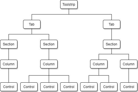
On a toolstrip tab, vertical lines indicate section boundaries. If a section has a title, the title appears at the bottom of the section in all uppercase letters. Columns are visible only when they contain at least one control. The size of the control depends on how many controls are in the column. Each column supports a maximum of three controls.
For example, the Simulation tab of the Simulink Toolstrip contains multiple sections, such as the File section. The File section contains two columns. The first column contains one control, titled New. The second column contains three controls, titled Open, Save, and Print.
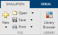
To create a hierarchy in the custom tab, the tab must have a
children property. To support controls, the tab must have a
child section, and the section must have a child column.
For each tab, specify:
type— Type of JSON object (Tab), specified as a stringid— Unique identifier within the toolstrip component, specified as a stringtitle— Text that appears as the tab label, specified as a stringchildren— Sections within the tab, specified as an array of JSON objects
For each section, specify:
type— Type of JSON object (Section), specified as a stringid(optional) — Unique identifier within the tab, specified as a stringtitle— Text that appears as the section label, specified as a stringchildren— Columns within the section, specified as an array of JSON objects
For each column, specify:
type— Type of JSON object (Column), specified as a stringid(optional) — Unique identifier within the section, specified as a stringwidth(optional) — Width of the column in pixels, specified as a numberchildren— Controls within the column, specified as an array of JSON objects
For example, create the layout for the Info and File sections from the prepopulated custom tab example, and title the sections.

Update the customTab.json file.
{
"version": "1.0",
"entries": [
{
"type": "Tab",
"id": "customTab",
"title": "CUSTOM TAB",
"children": [
{
"type": "Section",
"title": "Info",
"children": [
{
"type": "Column",
"children": []
}
]
},
{
"type": "Section",
"title": "File",
"children": [
{
"type": "Column",
"children": []
},
{
"type": "Column",
"children": []
}
]
}
]
}
]
}To display the changes on the custom tab, reload the toolstrip configuration.
slReloadToolstripConfig;

The two sections and their titles appear. The columns are not visible because they are empty.
Choose Among Types of Controls
Different types of controls serve different goals. The default Simulink Toolstrip tabs contain a variety of controls. When a column has more than one control, the controls resize so that each control uses one third of the vertical space in the column.
Custom tabs support the subset of controls described in this table.
| Control | Appearance | Description | JSON Object Type |
|---|---|---|---|
Push button | Full size:
Reduced size:
| A push button performs an action. | PushButton |
Drop-down button | Full size:
Reduced size:
| A drop-down button displays a pop-up list. | DropDownButton |
Split button | Full size:
Reduced size:
| A split button is a combination of a push button and a drop-down button. The push button part performs an action, and the button arrow shows a pop-up list. | SplitButton |
Empty control | Same appearance as empty parts of the toolstrip | An empty control adds a blank space where a control would otherwise be. | EmptyControl |
Add up to three controls to the children property of each
column. The order of the controls in the JSON file determines the order in which
they appear in the column.
For each control, specify:
type— Type of JSON object, specified as a string.id(optional) — Unique identifier within the column, specified as a string.action(conditional) — Appearance and behavior of the control, specified as a string. Omit this property for empty controls.popupName(conditional) — Name of a pop-up list for a drop-down or split button, specified as a string. Omit this property for push buttons and empty controls.
Get Built-In Simulink Actions
To get the name and icon for a built-in action from the Simulink Toolstrip, use the slUIDeveloperMode function.
In the MATLAB Command Window, enter this command:
slUIDeveloperMode("on")ans = logical 0
The command enables developer mode for the Simulink Toolstrip. The returned value indicates that developer mode was disabled before you entered the command.
Pause on an item in the Simulink Toolstrip and press Ctrl. On a Mac, press command (⌘) instead of Ctrl.
For example, pause on the Open button and press Ctrl.
Action: openModelAction
Icon: open
-------------------
The names of the corresponding action and icon appear in the MATLAB Command Window.
Specify Built-In Simulink Actions
After you get the name of a built-in Simulink action, specify it as the action for a control by using it to define
the action property of the control.
For example, create the Open push button from the prepopulated custom tab example.

On the Simulation tab, get the built-in action for the Open button.
Action: openModelAction
Icon: open_24
-------------------
Update the customTab.json file.
{
    "version": "1.0",
    "entries": [
        {
            "type": "Tab",
            "id": "customTab",
            "title": "CUSTOM TAB",
            "children": [
                {
                    "type": "Section",
                    "title": "Info",
                    "children": [
                        {
                            "type": "Column",
                            "children": []
                        }
                    ]
                },
                {
                    "type": "Section",
                    "title": "File",
                    "children": [
                        {
                            "type": "Column",
                            "children": []
                        },
                        {
                            "type": "Column",
                            "children": [
                                {
                                    "type": "PushButton",
                                    "action": "openModelAction"
                                }
                            ]
                        }
                    ]
                }
            ]
        }
    ]
}
To see the push button, reload the toolstrip configuration.
slReloadToolstripConfig;

Define Custom Actions
To define a custom appearance and behavior for controls:
Create a MATLAB script or function that performs the action. The file must be on the MATLAB path.
Optionally, get a built-in icon or save 16-by-16 and 24-by-24 pixel versions of a custom icon to the
iconfolder in theresourcesdirectory. Custom icons must be saved as PNG files.In the
jsonfolder of theresourcesdirectory, create a JSON file that defines actions and icons. For example, create a JSON file namedcustomTab_actions.json.Populate the new file with the required JSON properties:
versionandentries. For example:{ "version": "1.0", "entries": [] }Define your custom actions and icons as JSON objects in the
entriesproperty.Reference the custom action from a JSON object.
For each action, specify:
type— Type of JSON object (Action), specified as a string.id— Unique identifier within the toolstrip component, specified as a string.text(optional) — Text that appears on the control as a label, specified as a string. When a control is alone in a column, its text can span two lines. Use\nto start a new line. When the control shares its column with other controls, a space replaces the line break.description(optional) — Text that provides additional information, specified as a string. When the action defines a control, the text appears as a tooltip when you pause on the control. When the action defines a list item for a pop-up list, the text appears underneath the title of the list item.icon(optional) — Built-in or custom icon that appears on the control, specified as a string.command— Name of the MATLAB script or callback function that runs when you click the control, specified as a string. Do not include file paths or file extensions in the name. Scripts are evaluated in the base workspace using theevalfunction. Callback functions are evaluated using thefevalfunction. Check that theevalorfevalfunction can evaluate the value you assign thecommandproperty.To use information about the current window in which the command is being executed, use functions instead of scripts. For more information, see Callback Info Object.
commandType(conditional) — Whether clicking the control runs a callback function or a script, specified as"Callback"(default) or"Script".
For each icon, specify:
type— Type of JSON object (Icon), specified as a string.id— Unique identifier within the toolstrip component, specified as a string.icon16(conditional) — 16-by-16 pixel version of a custom icon for a reduced-size control, specified as a string. The icon must be saved as a PNG file.icon24(conditional) — 24-by-24 pixel version of a custom icon for a full-size control, specified as a string. The icon must be saved as a PNG file.
For example, create the MathWorks Website button from the prepopulated custom tab example.

Create a script named openMathWorksWebsite.m that opens the
MathWorks® website. Make sure the script is on the MATLAB path.
web('https://www.mathworks.com')Add 16-by-16 and 24-by-24 pixel versions of a custom icon to the
icon folder in the resources directory.
This example uses two PNG files that indicate their size in their file names
(openMathWorksWebsite_16.png and
openMathWorksWebsite_24.png).
Create the customTab_actions.json file. In this file, define
the custom action (openMathWorksWebsiteAction) and icon
(openMathWorksWebsiteIcon).
{
    "version": "1.0",
    "entries": [
        {
            "type": "Action",
            "id": "openMathWorksWebsiteAction",
            "text": "MathWorks\nWebsite",
            "description": "Open the MathWorks website",
            "icon": "openMathWorksWebsiteIcon",
            "command": "openMathWorksWebsite",
            "commandType": "Script"
        },
        {
            "type": "Icon",
            "id": "openMathWorksWebsiteIcon",
            "icon16": "openMathWorksWebsite_16.png",
            "icon24": "openMathWorksWebsite_24.png"
        }
    ]
}
In the customTab.json file, add the push button and reference
the openMathWorksWebsiteAction action.
{
    "version": "1.0",
    "entries": [
        {
            "type": "Tab",
            "id": "customTab",
            "title": "CUSTOM TAB",
            "children": [
                {
                    "type": "Section",
                    "title": "Info",
                    "children": [
                        {
                            "type": "Column",
                            "children": [
                                {
                                    "type": "PushButton",
                                    "action": "openMathWorksWebsiteAction"
                                }
                            ]
                        }
                    ]
                },
                {
                    "type": "Section",
                    "title": "File",
                    "children": [
                        {
                            "type": "Column",
                            "children": []
                        },
                        {
                            "type": "Column",
                            "children": [
                                {
                                    "type": "PushButton",
                                    "action": "openModelAction"
                                }
                            ]
                        }
                    ]
                }
            ]
        }
    ]
}
To see the custom push button, reload the toolstrip configuration.
slReloadToolstripConfig;

Using developer mode, you can get the fully qualified names of custom actions and icons on
a custom tab. For more information, see slUIDeveloperMode.
Action: custom:openMathWorksWebsiteAction
Icon: custom:openMathWorksWebsiteIcon
-------------------
You can also define a custom icon in a custom action, a custom action in a control, and a MATLAB command in a JSON file. For example, this push-button control uses nested JSON objects to define the custom action and icon and the command no longer references an external script.
{
    "type": "PushButton",
    "action": {
        "text": "MathWorks\nWebsite",
        "description": "Open the MathWorks website",
        "icon": {
            "icon16": "openMathWorksWebsite_16.png",
            "icon24": "openMathWorksWebsite_24.png"
        },
        "command": "web('https://www.mathworks.com')",
        "commandType": "Script"
    }
}
Nesting JSON objects and defining commands in the JSON file add complexity to the JSON file. Debugging is easier when you have fewer levels of hierarchy and use MATLAB functions or scripts to define and debug commands.
Choose Among Pop-Up List Elements
Pop-up lists display multiple actions in a menu. You can use them to simplify the appearance of your custom tab by grouping similar actions under one control. Drop-down and split buttons support pop-up lists.
The order in which you add elements to the pop-up list determines the order in which they appear in the list. This table describes the elements you can add to a pop-up list.
| List Control | Appearance | Description | JSON Object Type |
|---|---|---|---|
List item |
| A list item performs an action, similar to a push button. | ListItem |
List item with pop-up list |
| A list item with a pop-up list displays a pop-up list, similar to a drop-down button. | ListItemWithPopup |
List header |
| A list header adds a titled heading to the list. | ListHeader |
List separator |
| A list separator adds a horizontal line to separate items in the list. | ListSeparator |
For each list item, specify:
type— Type of JSON object (ListItemorListItemWithPopup), specified as a string.id(optional) — Unique identifier within the pop-up list, specified as a string.action— Appearance and behavior of the list item, specified as a string.showDescription(optional) — Option to display the text from thedescriptionproperty of the action on the list item, specified as a Boolean (trueorfalse). By default, the list item displays the description.popupName(conditional) — Name of another pop-up list, specified as a string. Omit this property forListItemJSON objects.
For each list header, specify:
type— Type of JSON object (ListHeader), specified as a stringid(optional) — Unique identifier within the pop-up list, specified as a stringtext— Text to appear in the heading, specified as a string
For each list separator, specify:
type— Type of JSON object (ListSeparator), specified as a stringid(optional) — Unique identifier within the pop-up list, specified as a string
Define Pop-Up Lists
To create pop-up lists:
Define any custom actions the pop-up lists use.
Get the built-in actions that the pop-up lists use.
In the
jsonfolder of theresourcesdirectory, create a JSON file that defines pop-up lists. For example, create a JSON file namedcustomTab_popups.json.Populate the new file with the required JSON properties:
versionandentries. For example:{ "version": "1.0", "entries": [] }Define the pop-up lists as JSON objects in the
entriesproperty.Reference each pop-up list from a JSON object for a drop-down button, split button, or list item with a pop-up list.
For each pop-up list, specify:
type— Type of JSON object (PopupList), specified as a stringid(optional) — Unique identifier within the toolstrip component, specified as a stringchildren— Elements within the pop-up list, specified as an array of JSON objects
For example, create the New drop-down button from the prepopulated custom tab example.
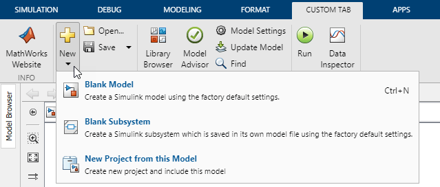
Get the built-in icon for the New button on the Simulation tab.
Action: createNewBlankModelAction
Icon: new_24
-------------------
The built-in icon has a suffix (_24) to indicate the icon size.
When you reference the icon for a custom action, drop this suffix.
In the customTab_actions.json file, add a custom action
(newPopUpAction) that defines the icon and text for the
drop-down button.
{
    "version": "1.0",
    "entries": [
        {
            "type": "Action",
            "id": "newPopUpAction",
            "text": "New",
            "icon": "new"
        },
        {
            "type": "Action",
            "id": "openMathWorksWebsiteAction",
            "text": "MathWorks\nWebsite",
            "description": "Open the MathWorks website",
            "icon": "openMathWorksWebsiteIcon",
            "command": "openMathWorksWebsite",
            "commandType": "Script"
        },
        {
            "type": "Icon",
            "id": "openMathWorksWebsiteIcon",
            "icon16": "openMathWorksWebsite_16.png",
            "icon24": "openMathWorksWebsite_24.png"
        }
    ]
}
Get the built-in actions for these buttons on the Simulation tab:
New > Blank Model
New > Blank Subsystem
New > Project > New Project from this Model
Action: createNewBlankModelAction
Icon: model_24
-------------------
Action: createNewBlankReferenceableSubsystemAction
Icon: referenceableSubsystem_24
-------------------
Action: createNewProjectFromModelAction
Icon: projectNewFromModel_24
-------------------
Create the customTab_popups.json file. In this file, define the
pop-up list (newPopUpList) for the button.
{
    "version": "1.0",
    "entries": [
        {
            "type": "PopupList",
            "id": "newPopUpList",
            "children": [
                {
                    "type": "ListItem",
                    "action": "createNewBlankModelAction"
                },
                {
                    "type": "ListItem",
                    "action": "createNewBlankReferenceableSubsystemAction"
                },
                {
                    "type": "ListItem",
                    "action": "createNewProjectFromModelAction"
                }
            ]
        }
    ]
}
In the customTab.json file, add the New
drop-down button and reference the corresponding action
(newPopUpAction) and pop-up list
(newPopUpList).
{
    "version": "1.0",
    "entries": [
        {
            "type": "Tab",
            "id": "customTab",
            "title": "CUSTOM TAB",
            "children": [
                {
                    "type": "Section",
                    "title": "Info",
                    "children": [
                        {
                            "type": "Column",
                            "children": [
                                {
                                    "type": "PushButton",
                                    "action": "openMathWorksWebsiteAction"
                                }
                            ]
                        }
                    ]
                },
                {
                    "type": "Section",
                    "title": "File",
                    "children": [
                        {
                            "type": "Column",
                            "children": [
                                {
                                    "type": "DropDownButton",
                                    "action": "newPopUpAction",
                                    "popupName": "newPopUpList"
                                }
                            ]
                        },
                        {
                            "type": "Column",
                            "children": [
                                {
                                    "type": "PushButton",
                                    "action": "openModelAction"
                                }
                            ]
                        }
                    ]
                }
            ]
        }
    ]
}
To see the New drop-down button and its pop-up list, reload the toolstrip configuration.
slReloadToolstripConfig;
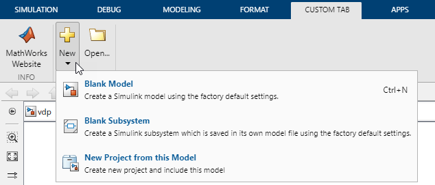
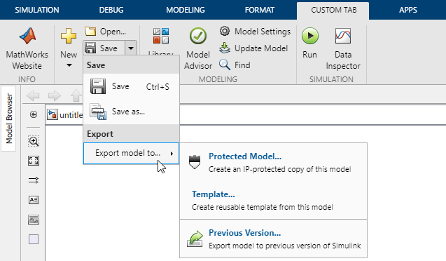
For a more complicated example, create the Save split button from the prepopulated custom tab example.
In the customTab_actions.json file, add a custom action
(exportPopUpAction) that defines the text for the list item
with a pop-up list.
{
    "version": "1.0",
    "entries": [
        {
            "type": "Action",
            "id": "newPopUpAction",
            "text": "New",
            "icon": "new"
        },
        {
            "type": "Action",
            "id": "exportPopUpAction",
            "text": "Export model to..."
        },
        {
            "type": "Action",
            "id": "openMathWorksWebsiteAction",
            "text": "MathWorks\nWebsite",
            "description": "Open the MathWorks website",
            "icon": "openMathWorksWebsiteIcon",
            "command": "openMathWorksWebsite",
            "commandType": "Script"
        },
        {
            "type": "Icon",
            "id": "openMathWorksWebsiteIcon",
            "icon16": "openMathWorksWebsite_16.png",
            "icon24": "openMathWorksWebsite_24.png"
        }
    ]
}
Get the built-in actions for these buttons on the Simulation tab:
Save
Save > Save As
Save > Protected Model
Save > Template
Save > Previous Version
Action: saveModelAction
Icon: save_24
-------------------
Action: saveModelAsAction
Icon: save_as_16
-------------------
Action: createProtectedModelAction
Icon: referencedModelProtect_16
-------------------
Action: exportModelToTemplateAction
Icon: exportModelToTemplate_16
-------------------
Action: exportModelToPreviousVersionAction
Icon: export_16
-------------------
In the customTab_popups.json file, define the two additional
pop-up lists:
savePopUpList— Pop-up list for the Save split buttonexportPopUpList— Pop-up list for the Export model to list item
For the list item that has a pop-up list, reference the corresponding action
(exportPopUpAction) and pop-up list
(exportPopUpList).
{
    "version": "1.0",
    "entries": [
        {
            "type": "PopupList",
            "id": "newPopUpList",
            "children": [
                {
                    "type": "ListItem",
                    "action": "createNewBlankModelAction"
                },
                {
                    "type": "ListItem",
                    "action": "createNewBlankReferenceableSubsystemAction"
                },
                {
                    "type": "ListItem",
                    "action": "createNewProjectFromModelAction"
                }
            ]
        },
        {
            "type": "PopupList",
            "id": "savePopUpList",
            "children": [
                {
                    "type": "ListHeader",
                    "text": "Save"
                },
                {
                    "type": "ListItem",
                    "action": "saveModelAction"
                },
                {
                    "type": "ListItem",
                    "action": "saveModelAsAction"
                },
                {
                    "type": "ListHeader",
                    "text": "Export"
                },
                {
                    "type": "ListItemWithPopup",
                    "action": "exportPopUpAction",
                    "popupName": "exportPopUpList"
                }
            ]
        },
        {
            "type": "PopupList",
            "id": "exportPopUpList",
            "children": [
                {
                    "type": "ListItem",
                    "action": "createProtectedModelAction"
                },
                {
                    "type": "ListItem",
                    "action": "exportModelToTemplateAction"
                },
                {
                    "type": "ListSeparator"
                },
                {
                    "type": "ListItem",
                    "action": "exportModelToPreviousVersionAction"
                }
            ]
        }
    ]
}
In the customTab.json file, add the Save
split button after the Open button. Reference the
corresponding action (saveModelAction) and pop-up list
(savePopUpList).
{
    "version": "1.0",
    "entries": [
        {
            "type": "Tab",
            "id": "customTab",
            "title": "CUSTOM TAB",
            "children": [
                {
                    "type": "Section",
                    "title": "Info",
                    "children": [
                        {
                            "type": "Column",
                            "children": [
                                {
                                    "type": "PushButton",
                                    "action": "openMathWorksWebsiteAction"
                                }
                            ]
                        }
                    ]
                },
                {
                    "type": "Section",
                    "title": "File",
                    "children": [
                        {
                            "type": "Column",
                            "children": [
                                {
                                    "type": "DropDownButton",
                                    "action": "newPopUpAction",
                                    "popupName": "newPopUpList"
                                }
                            ]
                        },
                        {
                            "type": "Column",
                            "children": [
                                {
                                    "type": "PushButton",
                                    "action": "openModelAction"
                                },
                                {
                                    "type": "SplitButton",
                                    "action": "saveModelAction",
                                    "popupName": "savePopUpList"
                                }
                            ]
                        }
                    ]
                }
            ]
        }
    ]
}
To see the Save split button and its pop-up lists, reload the toolstrip configuration.
slReloadToolstripConfig;
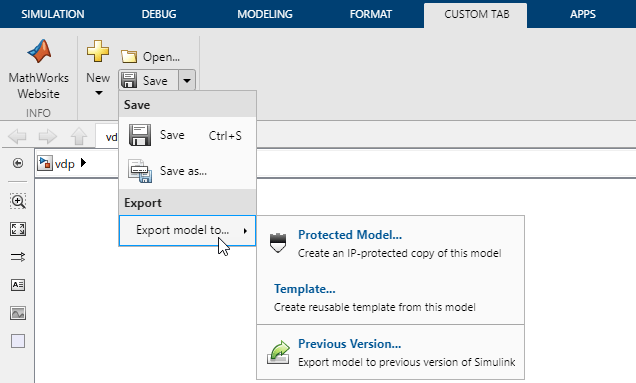
To vertically align the first control with the top of the column, add an empty control under the Save split button.
{
    "version": "1.0",
    "entries": [
        {
            "type": "Tab",
            "id": "customTab",
            "title": "CUSTOM TAB",
            "children": [
                {
                    "type": "Section",
                    "title": "Info",
                    "children": [
                        {
                            "type": "Column",
                            "children": [
                                {
                                    "type": "PushButton",
                                    "action": "openMathWorksWebsiteAction"
                                }
                            ]
                        }
                    ]
                },
                {
                    "type": "Section",
                    "title": "File",
                    "children": [
                        {
                            "type": "Column",
                            "children": [
                                {
                                    "type": "DropDownButton",
                                    "action": "newPopUpAction",
                                    "popupName": "newPopUpList"
                                }
                            ]
                        },
                        {
                            "type": "Column",
                            "children": [
                                {
                                    "type": "PushButton",
                                    "action": "openModelAction"
                                },
                                {
                                    "type": "SplitButton",
                                    "action": "saveModelAction",
                                    "popupName": "savePopUpList"
                                },
                                {
                                    "type": "EmptyControl"
                                }
                            ]
                        }
                    ]
                }
            ]
        }
    ]
}
To see the effect of the empty control, reload the toolstrip configuration.
slReloadToolstripConfig;

Share Custom Tabs
To share a custom tab with team members, share the resources
folder and the supporting files referenced by custom actions.
The resources folder must be in a folder that is on the
MATLAB path. If multiple resources folders use the same
component name, only one of the components with that name loads.
If the resources folder is in a folder that belongs to an
add-on and the add-on is disabled, the toolstrip customizations specified in the
resources folder are also disabled. To enable the
customizations, enable the add-on.
If a team member does not have a license or product installation required by one of the controls on the custom tab, the control appears as a button with no text, icon, tooltip, or action.
See Also
slCreateToolstripComponent | slCreateToolstripTab | slReloadToolstripConfig | slUIDeveloperMode


