ANNOUNCEMENT: New charts visualization engine

Vinod on 15 Aug 2024
Latest activity Reply by Pedro on 9 Feb 2025

With a deployment of ThingSpeak on August 15th, 2024, we are using a new library for visualization of ThingSpeak channel charts. This should require no changes on your part. If you notice any discrepancies/differences in your channel visualization, please post a screenshot on this thread.
Pedro
Pedro on 8 Feb 2025
Hi,
I have detected that if a field has only one data, it cannot be displayed with type column, only with type line.
Regards
Vinod
Vinod on 8 Feb 2025

Can you tell me more about this use case -- why would your channel have just a single value, other than perhaps you're testing something in a new channel?

Pedro
Pedro on 9 Feb 2025
Hi,
The value is monthly, one at January, one at February, etcetera.
Regards.
Pedro
Pedro on 12 Oct 2024
hi,
if I write a number at Data min or Data max, the chart doesn't upload when new data is sended, I must press F5 for refresh for view it. But I don't write nothing at Data min and Data max the chart is upload automatically every data is sended.
Vinod
Vinod on 12 Oct 2024

For users with a free ThingSpeak license, the charts are refreshed automatically every 15 seconds if the tab is in the browser foreground. Users with a paid license can set the update rate as fast as once a second. This is working as expected.

Pedro
Pedro on 12 Oct 2024
Vinod
Vinod on 14 Oct 2024
Thank you for reporting the issue. We're working on a fix for this.
Martin Rice
Martin Rice on 11 Oct 2024
y-axis values now OK, thanks.
Manne Tervaskanto
Manne Tervaskanto on 3 Oct 2024
Now if the values of the variable are over 1000, the y-axis is now rounded to 1.0k and resolution is weak. See an example of air pressure that varies between 1017-1021 hPa, but it is impossible to see that based on the chart y-axis.
Vinod
Vinod on 3 Oct 2024

Thank you for reporting it. The issue is the same as Martin reports below where the dynamic range of the axis labels is incorrect. We have a fix incoming within the next week.

Vinod
Vinod on 10 Oct 2024
@Manne Tervaskanto: This should be fixed now. Please confirm.
Manne Tervaskanto
Manne Tervaskanto on 11 Oct 2024

Hi. Yes, looks great now. Thanks!

Manne Tervaskanto
Manne Tervaskanto on 14 Oct 2024
Hello,
I need to come back to this discussion. In the example of air ambient pressure, trend still doesn't show correctly. Trend values varies from 1009 to 1017 hPa, but there is only one vertical axis value 1.01k showing the axis range. In the figures which are showing smaller values trends are ok now. Is it possible to get similar scaling to values above 1.0k? Thanks a lot.
Vinod
Vinod on 14 Oct 2024
Thanks for reporting, @Manne Tervaskanto. The issue here is that we can only show 3 significant figures without the y-tick labels overwriting the y-label text.
The algorithm rounds 1009 to 1.01k. 1017 will be rounded up to 1.02k. However, that would make the chart squeezed out, i.e., only a small portion of the axis between 1.01k and 1.02k would be used by the data and it would appear to be a flat line.
As a user, what would you expect to see - a flat-ish line of the data with the majority of the chart blank and the two horizontal lines, or, the view as above?
Martin Rice
Martin Rice on 22 Sep 2024
The new visualization library still has bugs.
I have a chart with y-axis minimum set to 125 and maximum 140 but the y-axis scale entries appears to be rounded to two significant figures, so 126, 128, 132 134 are all rounded to 130, while 136, 138 are rounded to 140. See
Another minor issue is that values on the y-axis between 10 and -10 are represented with two decimal digits, thus 5 becomes 5.00, 0 becomes 0.00. See
Vinod
Vinod on 22 Sep 2024

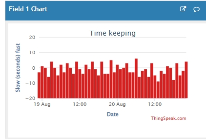
Thank you for reporting that, Martin. It looks like the rounding of the numbers needs better resolution. We'll look to resolve this in the next release.

Vinod
Vinod on 10 Oct 2024 (Edited on 10 Oct 2024)
@Martin Rice: I believe this is also resolved. Please confirm. If you have set manual axis limits for the charts, you may need to switch back to automatic limits to get the benefits of the built-in autoscaling.
martin C
martin C on 31 Aug 2024
Timescale in chart options not saving and charts have to be updated manually where up until recently they were updating automatically every 10 minutes
Vinod
Vinod on 31 Aug 2024 (Edited on 31 Aug 2024)

I'm unable to reproduce that. Can you try logging out of thingspeak, logging back in, saving your chart's timescale setting and reloading the page to confirm the setting has saved?

Also, charts are updating normally every 15 seconds as long as the page is visible in the browser window. If the page is one of the background tabs on the browser, the browser may stop refreshing it automatically.

martin C
martin C on 1 Sep 2024
Have tried logging in repeatedly but the timescale setting never saves. I had it refreshing every 10 minutes which was working perfectly for several years but has now stopped refreshing unless I do it manually. Having the browser window open makes no difference. Oddly though the visualisations are updating ok but the graphs are not. Have tried it in Microsoft Edge browser and Brave. Both exhibit the same symptoms
Vinod
Vinod on 1 Sep 2024

Let me investigate the saving of the timescale setting in Monday.

As to the visualization - I initially thought that was the chart visualization. Perhaps you're talking about MATLAB visualization. If so, having them auto refresh requires a paid thingspeak license. Did you have a paid thingspeak license that was not renewed? You can find more details about your license type on you account page on thingspeak.

martin C
martin C on 1 Sep 2024
Sorry, not visualizations but the round plugin dials.
They appear to update automatically but not the graphs. I have the free licence.
Vinod
Vinod on 5 Sep 2024
From the analysis we did, there is a bug in that the parameter values in the dropdowns shown when you click the chart's pencil icon are not displayed correctly. They are saved on the backend, but, the UI does not show this once the page is refreshed. This is a bug and will be fixed in the upcoming release.
As for the 'timescale', When you pick any value other than null, the page has to be refreshed manually. This behavior has existed for over 10 years. As to the reasoning behind this -- if you pick a non-empty timescale, it means you want to see the first point in that 'x' minute window (where 'x' is the value you pick in the dropdown). I believe the logic behind what is implemented in the code it is more likely that a user will refresh the page than wait for it to auto update when you are looking at data that refreshes very slowly. Arguably, this is incorrect, and we will look to address that separately. For now, for the auto-refresh chart, pick the null value for timescale dropdown of the chart and hit save. If you pick a non-null value, you will need to refresh the page.
Vinod
Vinod on 19 Sep 2024
The timescale setting not showing up correctly despite being saved on the backend has been fixed. Now, if you edit the value using the pencil icon and load it back up, you will see the saved setting.
Martin Rice
Martin Rice on 20 Aug 2024
Column charts are now incorrectly drawn. The columns should start at zero and extend up/down for positive/negative data values, but currently the columns all start at the most negative value of the y-axis.
They used to look like this:
But now they look lke this:
Vinod
Vinod on 20 Aug 2024
Thanks for reporting the issue. We will look to fix this in an upcoming release.
Martin Rice
Martin Rice on 5 Sep 2024
Waiting patiently...!
When do you expect to mend this issue?
Vinod
Vinod on 19 Sep 2024
This is resolved as of 09/19/2024.
mk f
mk f on 15 Aug 2024
introduced an unwanted amount of space on the left of the cart...
example a 1200 width cahart is no more 1200 but +- 150 space on the left and a 1050 chart
thanks
Vinod
Vinod on 15 Aug 2024 (Edited on 15 Aug 2024)
Can you please share a screenshot with the change that you want to see highlighted?
mk f
mk f on 15 Aug 2024
in fact not a big difference, let's say that I prefer the old render.... :)
thanks
Vinod
Vinod on 15 Aug 2024
Thank you! Looks like you're embedding the chart on your own page and not viewing it on ThingSpeak, correct?
At first glance I believe the empty space is to ensure we have enough space to add a Y-axis label. In your case you don't have a label, so that space is not used as efficiently as before.
We'll look into it in some more detail.
mk f
mk f on 16 Aug 2024
yes, it is embedded in my own page
b