Visualize Chart Execution with the Activity Profiler
The Activity Profiler allows you to examine the behavior of your Stateflow® chart. When you enable the Activity Profiler, after simulation, your Stateflow chart is highlighted to show which states were entered, transitions were taken, or functions were executed during the time that the simulation is running, also known as the simulation time. Additionally, you can see the duration of time that was spent in each state. To adjust the simulation time, in the Simulation tab, change the Stop time number.
With the Activity Profiler, you can quickly
Assess the behavior of your chart.
View states and transitions of your chart that are never entered or taken.
The Activity Profiler is not supported in referenced models or with fast restart mode.
Debug with the Activity Profiler
You can use the Activity Profiler as a complement to the Stateflow debugger. With the Activity Profiler, you can immediately see areas in your chart that were never reached or were constantly active, which can result in a faster debugging process. Additionally, you can view atomic states to see how often they are entered and how often their corresponding transitions are taken. With this information, it is easier to identify transition logic issues and solve problem areas in your chart such as:
Transitions that are taken too often and serve no purpose
Charts that are activated too often and slow down performance, such as an unexpected loop
A bottleneck, such as a controller state that has multiple incoming transitions
After finding the specific problem areas, you can then set breakpoints to debug your chart. Without the Activity Profiler, you would have to set many breakpoints within your chart to pinpoint the problem area.
Enable the Activity Profiler
To enable the Activity Profiler, in the Stateflow editor, in the Debug tab, click Activity Profiler. On the bottom of the Stateflow Editor, the Activity Profiler pane appears below your chart.

To show how each state, transition, and function is executed, click Run. In the Stateflow editor, your chart is highlighted to show how many times a state is entered, a transition is taken, or a function is executed. The Activity Profiler pane shows four columns: State, Duration, Duration Percentage, and Number of Entries.
The Activity Profiler pane remains empty any time that the simulation is running, or paused for debugging. Once the simulation is complete the Activity Profiler pane populates and the canvas highlighting appears.
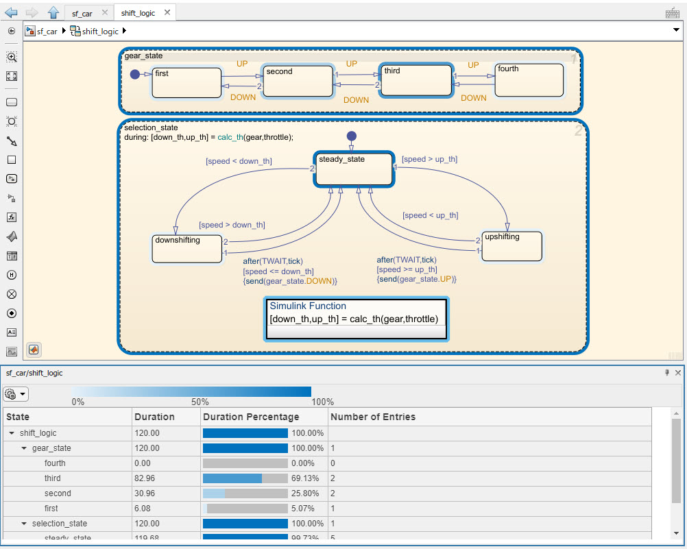
The State column lists the states in your Stateflow chart, along with their child states. The Duration column displays the duration of time (in seconds) spent in each state during the simulation. The Duration Percentage column shows a bar that represents what percentage of the runtime was spent in each state in relation to the parent chart. The Number of Entries column is the number of times each state was entered during simulation time.
You can also hover over a state or transition to see this data.
After running the simulation, you can toggle the highlighting and the Activity Profiler table off and on. In the Debug tab, open the Activity Profiler drop-down.
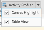
To turn off the canvas highlighting, clear Canvas
Highlight. To turn off the Activity Profiler table, clear
Table View.
Activity Profiler Preferences
The Activity Profiler is customizable. You have the option to highlight specific group of objects in the chart or change the color scheme. Specifying the highlighting allows you to focus on only one area. Changing the color scheme can help you visualize the data in different ways.
Highlighting Options
To change the highlighting options, in the Activity Profiler table, select the
Activity Profiler preferences drop-down menu ![]() . Under Canvas Highlight
Options, you can choose to enable highlighting for:
. Under Canvas Highlight
Options, you can choose to enable highlighting for:
States
Transitions
Functions
This is a global setting. If you change this setting in one model, all other models will appear this way.
Color Scheme Options
You can change the appearance of the Activity Profiler by changing the color
scheme. To change the color scheme, click the Activity Profiler preference menu
![]() . Under Color Scheme, select one of the
available color schemes. The legend above the Activity Profiler table shows how
the colors appear on the chart.
. Under Color Scheme, select one of the
available color schemes. The legend above the Activity Profiler table shows how
the colors appear on the chart.
![]()
Some color schemes change the shade of an object based on usage, similar to a
heat map. For example, the Blue setting darkens
objects as they become active for a greater percentage of the simulation.
Other color schemes use discrete instead of continuous colors. For example,
the HotCold setting highlights objects that are
active for less than 20% or greater than 80% of the simulation.
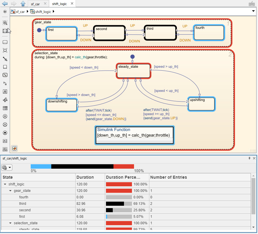
In this chart, you can see that the states upshifting, downshifting, and first were active for 20% or less of the total runtime. The states gear_state, selection_state, and steady_state were all active for 80% or more of the runtime. The states second and third were active between 20 and 80% of the runtime. The state fourth was not entered at all and remains not highlighted.
Explore
To view only subcharts and their child states, in the Activity Profiler table, right-click on the subchart name and select Explore. The Activity Profiler table adjusts to only include data about that subchart and its child states. Once you select the subchart as the current scope for the Activity Profiler pane, the duration percentage is in relation to the selected subchart.
See Also
Topics
Select a Web Site
Choose a web site to get translated content where available and see local events and offers. Based on your location, we recommend that you select: United States.
You can also select a web site from the following list
Americas
- América Latina (Español)
- Canada (English)
- United States (English)
Europe
- Belgium (English)
- Denmark (English)
- Deutschland (Deutsch)
- España (Español)
- Finland (English)
- France (Français)
- Ireland (English)
- Italia (Italiano)
- Luxembourg (English)
- Netherlands (English)
- Norway (English)
- Österreich (Deutsch)
- Portugal (English)
- Sweden (English)
- Switzerland
- United Kingdom (English)