Visualize Simulation Data on XY Plot
This example shows how to plot data on an XY plot in the Simulation Data
Inspector and use the replay controls to analyze relationships among plotted
signals. You run two simulations of the model sldemo_bounce and analyze
the relationship between the position and velocity of the bouncing ball.
The XY plot used in this example is also available in the Record block and the XY Graph block. When you use the XY plot in the Record block and the XY Graph block, you add the visualization and configure the appearance using the toolstrip. You plot data on the XY plot the same way shown in this example.
Open and Simulate Model
Open the model sldemo_bounce.
mdl = "sldemo_bounce";
openExample("simulink_general/sldemo_bounceExample",SupportingFile=mdl)
The model represents the dynamics of a bouncing ball using a Second-Order
Integrator block. The Position and
Velocity signals are marked for logging. During simulation, the
signal data streams to the Simulation Data Inspector and logs to the
workspace. For more information about how the model implements the dynamics of a
bouncing ball, see Simulation of Bouncing Ball.
To simulate the model, on the Simulation tab, click Run. Then, to open the Simulation Data Inspector, on the Simulation tab, under Review Results, click Data Inspector.
Alternatively, use these commands to simulate the model and open the Simulation Data Inspector programmatically.
out = sim(mdl);
Simulink.sdi.view
Plot Data on XY Plot
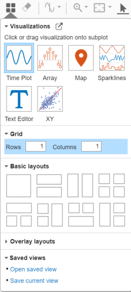
By default, the Simulation Data Inspector uses time plots for each
subplot in the layout. To plot the data on an XY plot, add the visualization to the
layout. Click Visualizations and layouts ![]() , then click or click and drag the
XY icon onto the subplot.
, then click or click and drag the
XY icon onto the subplot.
To plot the signals on the XY plot, in the signal table, select the signals you want to plot. Then, assign the signal pairs to the x- and y-axes. For this example:
Select the check boxes next to the
PositionandVelocitysignals.Assign the
Positionsignal to the x-axis. In the XY Data dialog box, in row 1 and the x-Axis column, selectPosition.Assign the
Velocitysignal to the y-axis. In row 1 and the y-Axis column, selectVelocity.Click OK.
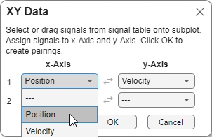
By using the XY Data dialog box, you can also:
Swap x and y data selections by clicking Swap
 .
.Plot additional pairs of x and y data using the drop-down lists in subsequent rows.
To modify the appearance of the XY plot, use the visualization settings. To open the
XY Plot visualization settings, click Visualization Settings ![]() . Then, to view the settings for the appearance of the
plotted data, click Axes.
. Then, to view the settings for the appearance of the
plotted data, click Axes.
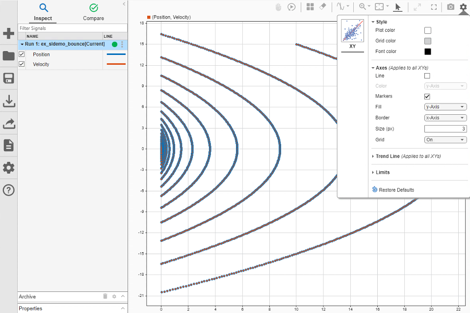
By default:
The XY plot shows the data as a scatter plot.
The marker fill color is the color of the signal assigned to the y-axis.
The marker border color is the color of the signal assigned to the x-axis.
To display only markers, only lines, or both markers and lines, select or clear Line and Markers. To change the colors of the line and markers, you can choose the color of the signal that provides the x data or the color of the signal that provides the y data. Specified settings apply to all XY plots in the layout.
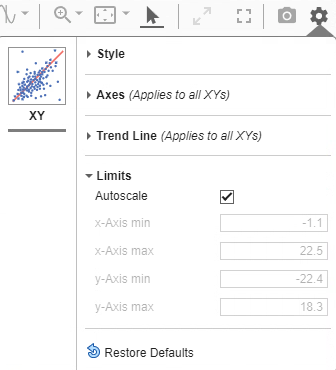
To configure the limits of the x- and y-axes, click Limits. By default, the XY plot limits are autoscaled to fit the data. To change the limits, clear Autoscale. Then, enter new minimum and maximum values for the x- and y-axes. The specified limits apply only to the currently selected XY subplot.
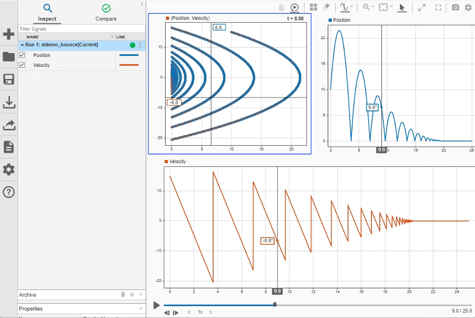
Add Time Plots and Inspect Data
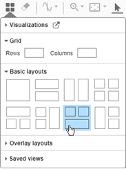
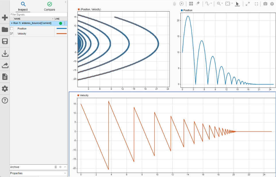
You can include multiple visualizations in a layout in the Simulation Data Inspector, Record block, or XY Graph block. For example, change to a layout with three subplots so you can see each signal on a time plot alongside the XY plot.
Click Visualizations and layouts
 .
.In the Basic Layouts section, select the layout with two subplots on top of a third subplot.
Plot the Position signal on the upper-right time plot and the
Velocity signal on the bottom time plot. To plot a signal on a
time plot, select the subplot where you want to plot the signal, then select the check
box next to the signal you want to plot.
To inspect the data, add a cursor. In the XY plot, the vertical line of the cursor shows the x-axis value, and the horizontal line shows the y-axis value. The time that corresponds to the point is displayed in the upper-right of the plot.
Move the cursor in the XY plot along the plotted line. To move the cursor, use the arrow keys on your keyboard or pause on a point in the line and click the highlighted point.
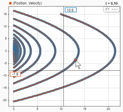
When you drag the cursor in a time plot, the cursor in the XY plot moves synchronously through the plotted data. The XY plot can have only one cursor. When you add two cursors to the layout, the XY cursor moves with the left cursor in the time plot.
Replay Data
Now that you have a comprehensive visualization of the simulation data, replaying the
data can help you understand the relationship between the signals. When you replay data
in the Simulation Data Inspector, animated cursors sweep through the logged
simulation data from the start time to the end time. To add the replay controls to the
view, click Show/hide replay controls ![]() .
.
You can control the speed of the replay and pause at any time. By default, the Simulation Data Inspector replays data at one second per second, meaning the cursor moves through one second of data in one second of clock time. The data in this example spans 25 seconds. Slow the replay speed by clicking the arrow to the left of the label.
For more information about using replay controls, see Replay Data in the Simulation Data Inspector.
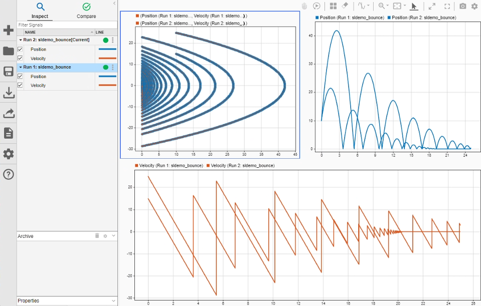
Analyze Data from Multiple Simulations
To analyze how changes in simulation parameters affect the data, you can plot multiple series on an XY plot. Simulate the model again using a higher initial velocity for the ball.
Using the Simulink Editor or the MATLAB® Command Window, change the
Initial value parameter of the Initial
Velocity block to 25. Then, simulate the model.
blk = mdl + "/Initial Velocity";
set_param(blk,Value="25")
out = sim(mdl);
The Simulation Data Inspector moves the first run to the archive and transfers the
view to the new run. To adjust the zoom level for the signals from the new run, click
Fit to View ![]() .
.
Drag the first run from the archive into the work area. Then, use the run actions menu to copy the plotted signal selection from the current run to the first run.
Click the three dots on the right of the row for the current run.
Under Plotted signal selection, select Copy.

To plot data from the first run, paste the plotted signal selection onto the run. Click the three dots on the right of the row for the first run. Then, under Plotted signal selection, select Paste.
The signals in both runs have the same names and the same signal colors. Change the colors for the signals in the first run.
Click the representation of the line in the table.
Select a new color.
Click Set.

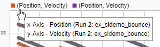
The signals in both runs also have the same name. To determine which run contains a plotted signal, use the tooltip in the legend.
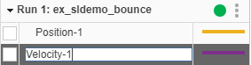
You can also rename the signals. For example, rename the signals in the first run
Position-1 and Velocity-1. To rename a signal,
double-click the name in the table and enter a new name.
When you add multiple series to an XY plot, each series gets a cursor. All cursors on the XY plot move synchronously, so all signal values displayed on the cursors correspond to the same time.

You can manage the series plotted on an XY plot using the XY Data dialog box. Right-click the XY plot to access the subplot context menu. Then, select Show plotted signals. Using the XY Data dialog box, you can remove a series from the plot or modify which signals provide the x and y data for each series.