Create 2-D Plots Using Map Axes
Map axes objects are a type of axes, similar to axes objects, geographic axes objects, and polar axes objects. Map axes support several types of plots, including point, line, and polygon plots, scatter plots, icon charts, bubble charts, and comet plots. For a list of plot types supported by map axes, see Types of 2-D Geographic Plots.
You can also use map axes with many MATLAB® graphics functions, including gca,
hold, geolimits, title, and
legend.
This topic shows how to create these types of plots using map axes:
Create Map Axes
Unlike other types of axes, map axes require you to create the map axes object before
plotting data into it. You can create a map axes object by using the
newmap or mapaxes function.
Create Point, Line, and Polygon Plots
Display points, lines, and polygons on map axes by using the geoplot function. You can specify geospatial tables, shape objects, or numeric coordinates as input to the geoplot function. When you specify geospatial tables or shape objects, you can plot data in any supported geographic or projected coordinate reference system (CRS).
Set up a new map. By default, map axes use an Equal Earth map projection.
figure
newmap
Read three shapefiles into the workspace. The files contain world land areas, rivers and cities. Then, display the land areas as green polygons, the rivers as blue lines, and the city locations as black points.
land = readgeotable("landareas.shp");
rivers = readgeotable("worldrivers.shp");
cities = readgeotable("worldcities.shp");

geoplot(land,FaceColor=[0.7 0.9 0.5],EdgeColor="none")
hold on
geoplot(rivers,Color=[0 0.4470 0.7410])
geoplot(cities,"k")
Add a title.
title("World Land Areas, Rivers, and Cities")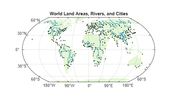
Create Scatter Plots
Display scatter plots on map axes by using the geoscatter function. To use the geoscatter function with map axes, you must specify the coordinates using numeric latitudes and longitudes.
Set up a new map using a projected CRS that is appropriate for Europe. For this example, create the CRS using the EPSG code 3035, which uses a Lambert Azimuthal Equal Area projection method.
figure
p = projcrs(3035);
newmap(p)
Read a shapefile containing world land areas into the workspace. Then, provide geographic context for the map by displaying the land areas. Exclude the land areas from the automatic selection of axes limits by setting the AffectAutoLimits property to "off".
land = readgeotable("landareas.shp");
geoplot(land,FaceColor=[0.7 0.7 0.7],EdgeColor=[0.65 0.65 0.65],AffectAutoLimits="off")
hold on
Read the numeric latitude and longitude coordinates of several European cities into the workspace. Display the city locations using a scatter plot.
[lat,lon] = readvars("european_capitals.txt");
geoscatter(lat,lon,"filled","diamond")
Add a title and subtitle.
title("European Cities")
subtitle(p.ProjectionMethod)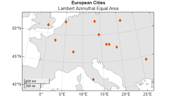
Create Icon Charts
Since R2024b
Display icon charts on map axes by using the geoiconchart function. To use the geoiconchart function with map axes, you must specify the coordinates using numeric latitudes and longitudes.
Set up a new map using a projected CRS that is appropriate for Massachusetts. For this example, create the CRS using the EPSG code 26986, which uses a Lambert Conic Conformal projection method.
figure
p = projcrs(26986);
newmap(p)
Create a geospatial table that contains an area of interest (AOI) for Massachusetts. Provide geographic context for the map by displaying the AOI.
mass = geocode("Massachusetts");
geoplot(mass,FaceColor=[0.7 0.7 0.7],EdgeColor=[0.65 0.65 0.65])
hold on
Specify the latitude and longitude coordinates of several wildlife sanctuaries in Massachusetts. Then, display the coordinates using an icon chart. By default, the geoiconchart function uses pushpin icons.
lat = [42.3 42.24 42.43 42.29 42.46 41.94 41.9];
lon = [-72.65 -71.76 -73.24 -71.1 -71.91 -71.3 -70];
geoiconchart(lat,lon)
Adjust the geographic limits. Then, add a title and subtitle.
geolimits([41.75 42.5],[-74 -69.5])

title("Wildlife Sanctuaries")
subtitle(p.ProjectionMethod)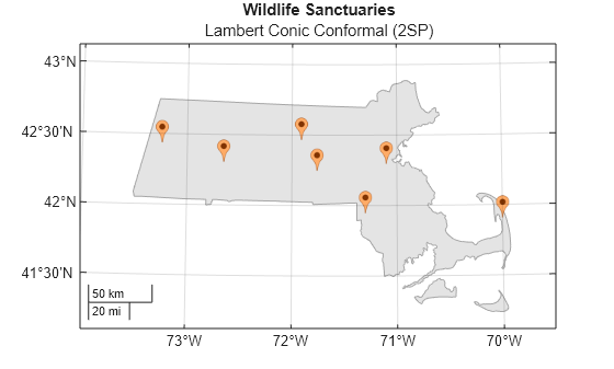
Create Bubble Charts
Display bubble charts on map axes by using the bubblechart function. To use the bubblechart function with map axes, you must specify the coordinates using numeric latitudes and longitudes.
Load Data
Load into the workspace a shapefile containing tsunami events, including attributes such as the maximum heights and the causes. Extract the latitudes, longitudes, maximum heights, and causes. Replace missing causes with "Unknown Cause".
tsunamis = readgeotable("tsunamis.shp",CoordinateSystemType="geographic");

lat = tsunamis.Shape.Latitude;
lon = tsunamis.Shape.Longitude;
maxheight = tsunamis.Max_Height;
c = categorical(tsunamis.Cause);
c = fillmissing(c,"constant","Unknown Cause");
Set Up Map
This example adds multiple legends to the bubble chart. To manage the alignment of the legends, use a tiled chart layout.
figure
t = tiledlayout(1,1);
nexttile
Set up a new map using a projected CRS that is appropriate for Southeast Asia. For this example, create a CRS using the ESRI code 102030, which uses a Lambert Conic Conformal projection method.
p = projcrs(102030,Authority="ESRI");
newmap(p)
Read a shapefile containing world land areas into the workspace. Provide geographic context for the map by displaying a subset of the land areas. Avoid including the land areas in the legend by setting the HandleVisibility property to "off".
land = readgeotable("landareas.shp");
subland = land([1:2,5:18,20:end],:);
geoplot(subland,HandleVisibility="off",FaceColor=[0.7 0.7 0.7],EdgeColor=[0.65 0.65 0.65])
hold on
Plot Data
Display the data using a bubble chart. To create a legend that illustrates the tsunami causes, use a separate bubble chart for each cause. Specify the bubble sizes using the maximum heights.
causes = categories(c);
numCauses = length(causes);

for k = 1:numCauses
    cause = causes(k);
    idx = c == cause;
    bubblechart(lat(idx),lon(idx),maxheight(idx),DisplayName=string(cause))
end
Customize Plot
Customize the plot by changing the bubble sizes, adding legends, changing the geographic limits, and adding a subtitle and title.
Specify the minimum and maximum bubble sizes (in points).
bubblesize([3 30])
Add two legends. Illustrate the bubble colors using a legend, and illustrate the bubble sizes using a bubble legend. Store each legend object by specifying an output argument for the bubblelegend and legend functions. Then, move the legends to the bottom outer tile of the tiled chart layout by setting the Layout.Tile property on each object to "south".
lgd = legend;
title(lgd,"Cause")
blgd = bubblelegend("Maximum Height (m)");

lgd.Layout.Tile = "south";
blgd.Layout.Tile = "south";
Change the bubble size limits to reflect the sizes of bubbles in Southeast Asia.
bubblelim([1 50])
Adjust the geographic limits.
geolimits([-20 20],[90 170])
Add a title and subtitle.
title("Tsunamis by Cause and Maximum Height")
subtitle(p.ProjectionMethod)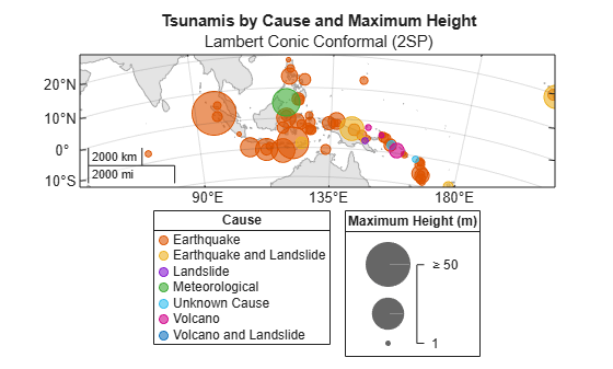
Display Images
Since R2026a
Display images on map axes by using the geoimage function. Specify the image using an array and a raster reference object in any supported geographic or projected CRS.
Read a GeoTIFF image of Boston [1] into the workspace as an array of RGB triplets and a raster reference object in projected coordinates.
[A,R] = readgeoraster("boston.tif");Set up a new map using the projected CRS that is stored in the reference object.
p = R.ProjectedCRS;
newmap(p)
Display the image on the map.
geoimage(A,R)
Add a title and subtitle.
title("Boston Imagery")
subtitle(p.ProjectionMethod)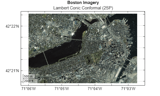
[1] The data used in this example includes material copyrighted by GeoEye, all rights reserved.
Create Pseudocolor Raster Plots
Since R2026a
A pseudocolor raster plot displays raster data by assigning colors to the values stored in the raster. Create a pseudocolor raster plot on map axes by using the geopcolor function. Specify the raster using a matrix and a raster reference object in any supported geographic or projected CRS.
Read elevation data for Colorado [1] into the workspace as a matrix and a raster reference object in geographic coordinates.
[Z,R] = readgeoraster("n40_w106_3arc_v2.dt1");Set up a new map using a projected CRS that is appropriate for northern Colorado. For this example, create the CRS using the EPSG code 2231, which uses a Lambert Conic Conformal projection method.
figure
p = projcrs(2231);
newmap(p)
Display the elevation data on the map. The plot applies scaled color using the colormap of the axes.
geopcolor(Z,R)
Apply a colormap that is appropriate for elevation data. Add a color bar.
demcmap(Z)
colorbar
Add a title and subtitle.
title("Elevation Data (m)")
subtitle(p.ProjectionMethod)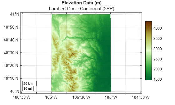
[1] The elevation data used in this example is from the US Geological Survey.