nyquistplot
Nyquist plot with additional plot customization options
Syntax
Description
nyquistplot lets you plot the Nyquist diagram of a dynamic
system model with a broader range of plot customization options than
nyquist. You can use nyquistplot to obtain the plot
handle and use it to customize the plot, such as modify the axes labels, limits and units. You
can also use nyquistplot to draw a Nyquist diagram on an existing set of
axes represented by an axes handle. To customize an existing Nyquist plot using the plot
handle:
Obtain the plot handle
Use
getoptionsto obtain the option setUpdate the plot using
setoptionsto modify the required options
For more information, see Customizing Response Plots from the Command Line (Control System Toolbox). To create Nyquist plots with default options or to
extract the standard deviation, real and imaginary parts of the frequency response data, use
nyquist.
h = nyquistplot(sys)sys and returns the plot handle h to the plot. You
can use this handle h to customize the plot with the getoptions and setoptions commands. If sys is a multi-input,
multi-output (MIMO) model, then nyquistplot produces a grid of Nyquist
plots, each plot displaying the frequency response of one I/O pair.
h = nyquistplot(___,w)w.
If
wis a cell array of the form{wmin,wmax}, thennyquistplotplots the Nyquist diagram at frequencies ranging betweenwminandwmax.If
wis a vector of frequencies, thennyquistplotplots the Nyquist diagram at each specified frequency.
You can use w with any of the input-argument combinations in
previous syntaxes.
See logspace to generate logarithmically spaced
frequency vectors.
h = nyquistplot(___,plotoptions)plotoptions.
You can use these options to customize the Nyquist plot appearance using the command line.
Settings you specify in plotoptions overrides the preference settings
in the MATLAB® session in which you run nyquistplot. Therefore, this
syntax is useful when you want to write a script to generate multiple plots that look the
same regardless of the local preferences.
Examples
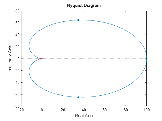
Customize Nyquist Plot using Plot Handle
For this example, use the plot handle to change the phase units to radians and to turn the grid on.
Generate a random state-space model with 5 states and create the Nyquist diagram with plot handle h.
rng("default")
sys = rss(5);
h = nyquistplot(sys);
Change the phase units to radians and turn on the grid. To do so, edit properties of the plot handle, h using setoptions.
setoptions(h,'PhaseUnits','rad','Grid','on');

The Nyquist plot automatically updates when you call setoptions.
Alternatively, you can also use the nyquistoptions command to specify the required plot options. First, create an options set based on the toolbox preferences.
plotoptions = nyquistoptions('cstprefs');Change properties of the options set by setting the phase units to radians and enabling the grid.
plotoptions.PhaseUnits = 'rad';
plotoptions.Grid = 'on';
nyquistplot(sys,plotoptions);
You can use the same option set to create multiple Nyquist plots with the same customization. Depending on your own toolbox preferences, the plot you obtain might look different from this plot. Only the properties that you set explicitly, in this example PhaseUnits and Grid, override the toolbox preferences.
Customize Nyquist Plot Title
Create a Nyquist plot of a dynamic system model and store a handle to the plot.
sys = tf(100,[1,2,1]);
h = nyquistplot(sys);
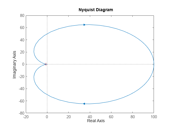
Change the plot title to read "Nyquist Plot of sys." To do so, use getoptions to extract the existing plot options from the plot handle h.
opt = getoptions(h)
opt =

                         FreqUnits: 'rad/s'
                          MagUnits: 'dB'
                        PhaseUnits: 'deg'
                   ShowFullContour: 'on'
          ConfidenceRegionNumberSD: 1
    ConfidenceRegionDisplaySpacing: 5
                        IOGrouping: 'none'
                       InputLabels: [1x1 struct]
                      OutputLabels: [1x1 struct]
                      InputVisible: {'on'}
                     OutputVisible: {'on'}
                             Title: [1x1 struct]
                            XLabel: [1x1 struct]
                            YLabel: [1x1 struct]
                         TickLabel: [1x1 struct]
                              Grid: 'off'
                         GridColor: [0.1500 0.1500 0.1500]
                              XLim: {[-20 100]}
                              YLim: {[-80 80]}
                          XLimMode: {'auto'}
                          YLimMode: {'auto'}
The Title option is a structure with several fields.
opt.Title
ans = struct with fields:
         String: 'Nyquist Diagram'
       FontSize: 11
     FontWeight: 'bold'
      FontAngle: 'normal'
          Color: [0 0 0]
    Interpreter: 'tex'
Change the String field of the Title structure, and use setoptions to apply the change to the plot.
opt.Title.String = 'Nyquist Plot of sys';
setoptions(h,opt)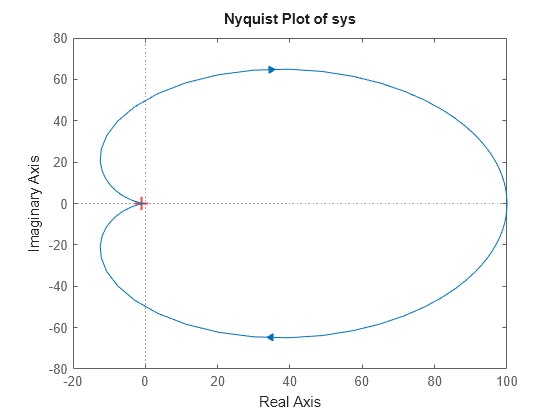
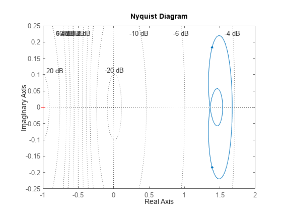
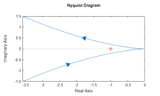
Zoom on Critical Point
Plot the Nyquist frequency response of a dynamic system. Assign a variable name to the plot handle so that you can access it for further manipulation.
sys = tf(100,[1,2,1]);
h = nyquistplot(sys);
Zoom in on the critical point, (–1,0). You can do so interactively by right-clicking on the plot and selecting Zoom on (-1,0). Alternatively, use the zoomcp command on the plot handle h.
zoomcp(h)
Nyquist Plot of Identified Models with Confidence Regions at Selected Points
Compare the frequency responses of identified state-space models of order 2 and 6 along with their 1-std confidence regions rendered at every 50th frequency sample.
Load the identified model data and estimate the state-space models using n4sid. Then, plot the Nyquist diagram.
load iddata1
sys1 = n4sid(z1,2);
sys2 = n4sid(z1,6);
w = linspace(10,10*pi,256);
h = nyquistplot(sys1,sys2,w);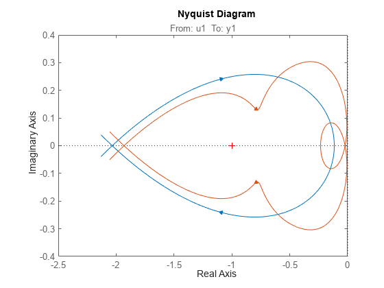
Both models produce about 76% fit to data. However, sys2 shows higher uncertainty in its frequency response, especially close to Nyquist frequency as shown by the plot. To see this, show the confidence region at a subset of the points at which the Nyquist response is displayed.
setoptions(h,'ConfidenceRegionDisplaySpacing',50,...
             'ShowFullContour','off');

To turn on the confidence region display, right-click the plot and select Characteristics > Confidence Region.

Nyquist Plot with Specific Customization
For this example, consider a MIMO state-space model with 3 inputs, 3 outputs and 3 states. Create a Nyquist plot, display only the partial contour and turn the grid on.
Create the MIMO state-space model sys_mimo.
J = [8 -3 -3; -3 8 -3; -3 -3 8];
F = 0.2*eye(3);
A = -J\F;
B = inv(J);
C = eye(3);
D = 0;
sys_mimo = ss(A,B,C,D);
size(sys_mimo)
State-space model with 3 outputs, 3 inputs, and 3 states.
Create a Nyquist plot with plot handle h and use getoptions for a list of the options available.
h = nyquistplot(sys_mimo);

p = getoptions(h)
p =

                         FreqUnits: 'rad/s'
                          MagUnits: 'dB'
                        PhaseUnits: 'deg'
                   ShowFullContour: 'on'
          ConfidenceRegionNumberSD: 1
    ConfidenceRegionDisplaySpacing: 5
                        IOGrouping: 'none'
                       InputLabels: [1x1 struct]
                      OutputLabels: [1x1 struct]
                      InputVisible: {3x1 cell}
                     OutputVisible: {3x1 cell}
                             Title: [1x1 struct]
                            XLabel: [1x1 struct]
                            YLabel: [1x1 struct]
                         TickLabel: [1x1 struct]
                              Grid: 'off'
                         GridColor: [0.1500 0.1500 0.1500]
                              XLim: {3x1 cell}
                              YLim: {3x1 cell}
                          XLimMode: {3x1 cell}
                          YLimMode: {3x1 cell}
Use setoptions to update the plot with the required customization.
setoptions(h,'ShowFullContour','off','Grid','on');

The Nyquist plot automatically updates when you call setoptions. For MIMO models, nyquistplot produces an array of Nyquist diagrams, each plot displaying the frequency response of one I/O pair.
Input Arguments
Output Arguments
Tips
There are two zoom options available from the right-click menu that apply specifically to Nyquist plots:
Full View — Clips unbounded branches of the Nyquist plot, but still includes the critical point (–1, 0).
Zoom on (-1,0) — Zooms around the critical point (–1,0). To access critical-point zoom programmatically, use the
zoomcpcommand. See Zoom on Critical Point.
To activate data markers that display the real and imaginary values at a given frequency, click anywhere on the curve. The following figure shows a Nyquist plot with a data marker.

Version History
Introduced in R2012a
See Also
getoptions | nyquist | setoptions | showConfidence | nyquistoptions
Topics
- Customizing Response Plots from the Command Line (Control System Toolbox)
You can also select a web site from the following list:
Americas
- América Latina (Español)
- Canada (English)
- United States (English)
Europe
- Belgium (English)
- Denmark (English)
- Deutschland (Deutsch)
- España (Español)
- Finland (English)
- France (Français)
- Ireland (English)
- Italia (Italiano)
- Luxembourg (English)
- Netherlands (English)
- Norway (English)
- Österreich (Deutsch)
- Portugal (English)
- Sweden (English)
- Switzerland
- United Kingdom (English)