Analyze Gene Expression Profiles Using Biopipeline Designer
This example shows how to look for patterns in gene expression profiles using neural networks, facilitated with the Biopipeline Designer app. The example requires Deep Learning Toolbox™ and Bioinformatics Toolbox™.
Specifically, the example analyzes gene expression changes in Saccharomyces cerevisiae (baker's yeast) during the diauxic shift when yeast switches from fermenting glucose to respiring ethanol after glucose is depleted. DNA microarray data is used to study how nearly all yeast genes change their expression over time during this metabolic transition. For additional details on this process, see Gene Expression Profile Analysis.
Enter the following command to open the prebuilt pipeline in Biopipeline Designer.
openExample('bioinfo/GeneExpressionAnalysisExample.m')
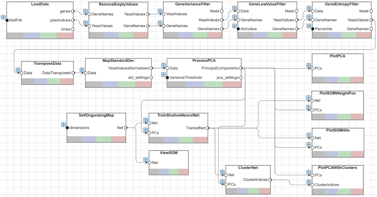
The app opens as shown next.
Load Data
This example uses data from [1]. The full data set can be downloaded from the Gene Expression Omnibus website: https://www.yeastgenome.org
The pipeline starts by first loading data into MATLAB® using a built-in Load block named LoadData. The data file yeastdata.mat was set by entering the appropriate filename in the MAT-file input port value within the Pipeline Inspector pane.
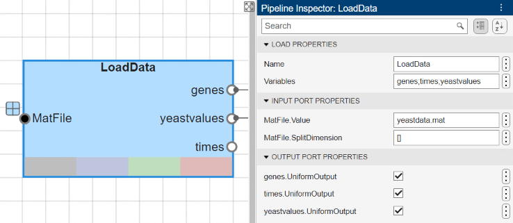
Gene expression levels were measured at seven time points during the diauxic shift. The variable times contains the times at which the expression levels were measured in the experiment. The variable genes contains the names of the genes whose expression levels were measured. The variable yeastvalues contains the "VALUE" data or LOG_RAT2N_MEAN, or log2 of ratio of CH2DN_MEAN and CH1DN_MEAN from the seven time steps in the experiment.
Filter Genes
The data set is quite large and a lot of the information corresponds to genes that do not show any interesting changes during the experiment. To find the interesting genes, first, reduce the size of the data set by removing genes with expression profiles that do not show anything of interest. There are 6400 expression profiles. You can use a number of techniques to reduce this to some subset that contains the most significant genes.
The gene list contains several spots marked as 'EMPTY'. These are empty spots on the array, and while they might have data associated with them, for the purposes of this example, you can consider these points to be noise.
The yeastvalues variable also contains several expression level is marked as NaN. This indicates that no data was collected for this spot at the particular time step. One approach to dealing with these missing values would be to impute them using the mean or median of data for the particular gene over time. This example uses a less rigorous approach of simply throwing away the data for any genes where one or more expression level was not measured.
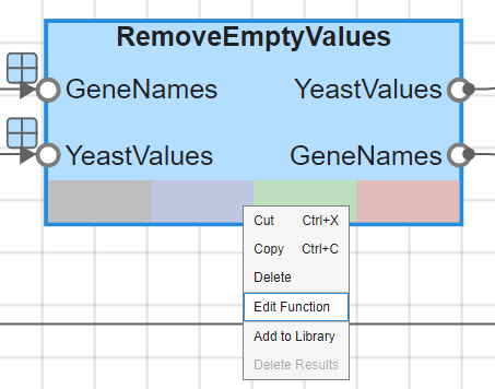
The UserFunction block RemoveEmptyValues removes all genes that are marked as 'EMPTY' or have NaN expression levels.
To view the custom function that this block uses, right-click the block and select Edit Function.
If you plot the expression profiles of all the remaining genes, you would see that most profiles are flat and not significantly different from the others. This flat data could still be useful because it indicates that these genes are not significantly affected by the diauxic shift. However, this example focuses on the genes with large changes in expression accompanying the diauxic shift. You can use filtering functions in Bioinformatics Toolbox to remove genes with various types of profiles that do not provide relevant information about genes affected by the metabolic change.
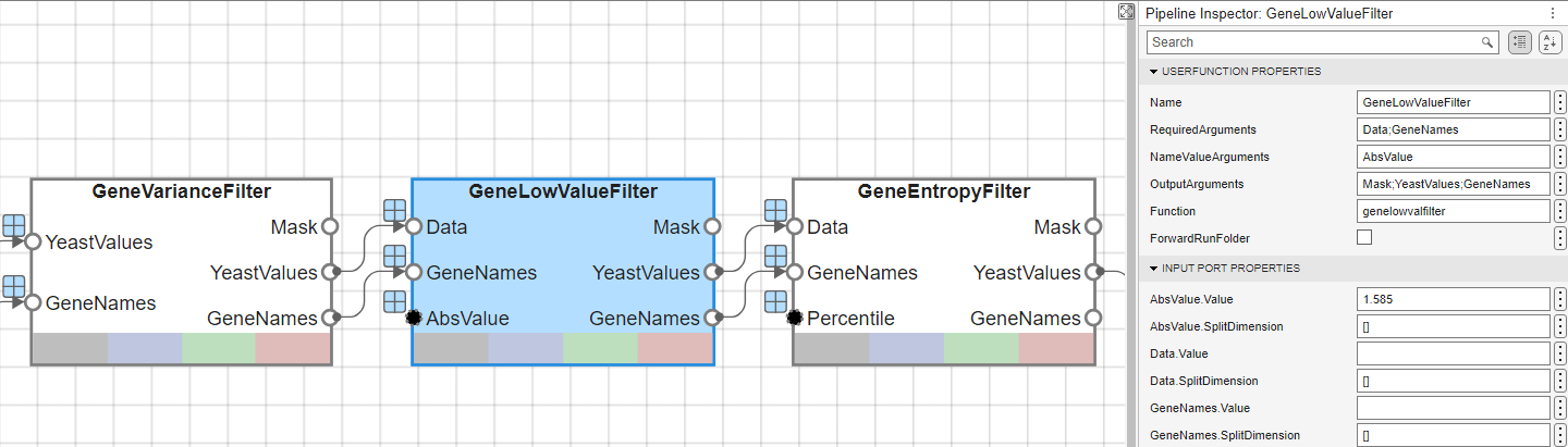
Use the genevarfilter function to filter out genes with small variance over time, the function genelowvalfilter to remove genes that have very low absolute value expression levels, and the geneentropyfilter to remove genes whose profiles have low entropy. These functions are each utilized within the UserFunction blocks named GeneVarianceFilter, GeneLowValueFilter, and GeneEntropyFilter, respectively.
The function that is used for each of these blocks can be accessed through the Function property of the corresponding UserFunction blocks. You can specify the values for AbsVal and Percentile in the Pipeline Inspector pane for the GeneLowValueFilter block and GeneEntropyFilter block, respectively. The next figure shows the GeneLowValueFilter block, where the threshold is defined as 1.585 within the AbsValue.Value text editor.
Perform Principal Component Analysis
Now that you have a manageable list of genes, you can look for relationships between the profiles.
Normalizing the standard deviation and mean of data allows the network to treat each input as equally important over its range of values.
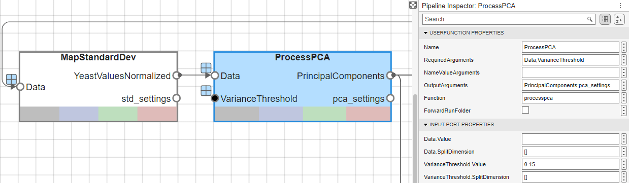
Principal-component analysis (PCA) is a useful technique that can be used to reduce the dimensionality of large data sets, such as those from microarray analysis. This technique isolates the principal components of the dataset eliminating those components that contribute the least to the variation in the data set.
The input vectors are first normalized, using mapstd, so that they have zero mean and unity variance. processpca is the function that implements the PCA algorithm. A variance threshold of 0.15 is provided to the processpca function, which means that processpca eliminates those principal components that contribute less than 15% to the total variation in the data set. The output of this block now contains the principal components of the yeastvalues data.
Similar to the filtering blocks above, these two blocks, MapStandardDev and ProcessPCA, are UserFunction blocks that call mapstd and processpca.
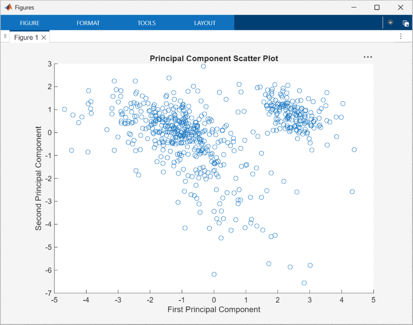
Visualize the principal components using the scatter function, specified in the UserFunction block PlotPCA, which generates the following figure:
Use Self-Organizing Maps for Cluster Analysis
You can cluster the principal components using the Self-Organizing map (SOM) clustering algorithm.
The selforgmap function creates a Self-Organizing map network which can then be trained with the train function.
These functions are utilized through the UserFunction blocks named SelfOrganizingMap and TrainShallowNeuralNet, respectively.
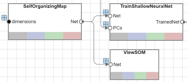
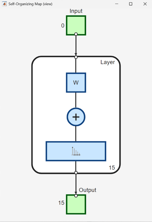
The UserFunction block ViewSOM calls the view function on the generated SOM for an overview of the network's architecture.
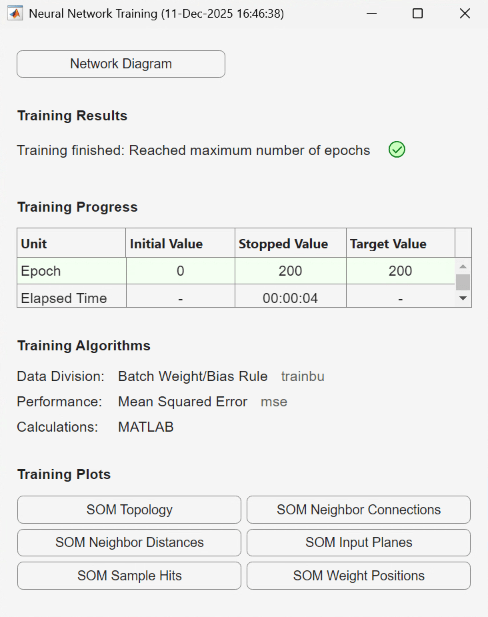
To train the network, use the Neural Network Training tool, which shows the network being trained and the algorithms used to train it. It also displays the training state during training and the criteria which stopped training are highlighted in green.
The Training Plots section of the tool provides various visualization plots that you can open during and after training.
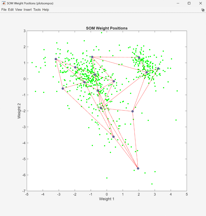
The UserFunction block PlotSOMWeightPos uses the plotsompos function to display the derived network over a scatter plot of the first two dimensions of the data.
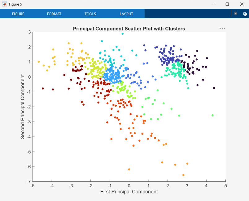
You can also assign clusters using the SOM by finding the nearest node to each point in the data set. This is performed within the UserFunction block ClusterNet and resulting clusters are plotted by the block PlotPCAWithClusters.
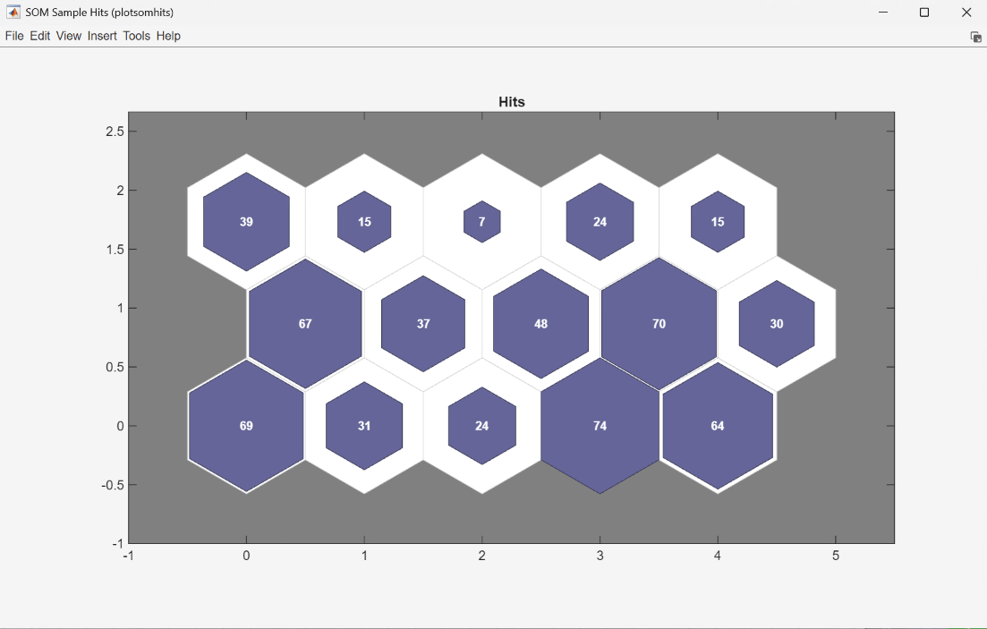
Finally, use plotsomhits to see how many vectors are assigned to each of the neurons in the map, within the UserFunction block PlotSOMHits.
You can also use other clustering algorithms, such as Hierarchical clustering and K-means, available in the Statistics and Machine Learning Toolbox™ for cluster analysis.
References
[1] DeRisi, Joseph L., Vishwanath R. Iyer, and Patrick O. Brown. “Exploring the Metabolic and Genetic Control of Gene Expression on a Genomic Scale.” Science 278, no. 5338 (1997): 680–86.
See Also
Biopipeline
Designer | bioinfo.pipeline.block.Load | bioinfo.pipeline.block.UserFunction